covid19-projections.com was launched in early April 2020 by independent data scientist Youyang Gu. Since the very beginning, the site’s goal was to use a data-driven, AI-based model to make the most accurate COVID-19 projections and estimates. By the end of April 2020, it was cited by the Centers for Disease Control & Prevention (CDC) as one of the first models to “help inform public health decision making”. In the months after, covid19-projections.com became one of the most widely-cited models in academia, media, government, and industry. It has been lauded by many as the most accurate COVID-19 model.
During the one-year period when the site was actively updated (April 2020 to March 2021), there have been three separate iterations of the covid19-projections.com model:
| Model Type | Time Frame | Updates | Countries | US States | US Counties |
|---|---|---|---|---|---|
| Death Forecasts (Details) | Apr 2020 - Oct 2020 | Daily | 71 countries | 50 + DC/territories | 34 counties |
| Infections Estimates (Methodology) | Nov 2020 - Mar 2021 | Daily | US | 50 + DC/territories | 3000+ counties |
| Vaccination Projections | Dec 2020 - Mar 2021 | 3-4x per week | US nationwide | — | — |
For an overview of all the pages on this site, see our Site Map.
Social media, especially Twitter, has been instrumental in shaping the models on this site. A lot of our original research was first posted by Youyang on Twitter. See our Twitter Threads page to see a comprehensive list of Tweets related to COVID-19.
The majority of this page is dedicated to explaining our death forecasting model that was active from April to October 2020. We also briefly go over our other model iterations in the next three sections.
Data and Code
Below is a list of all of our GitHub repositories that contain data and code related to COVID-19:
- Main COVID-19 Repository
- Infections Estimates
- Historical CDC Vaccination Data
- COVID-19 Datasets
- SEIR Simulator
- Model Evaluations
- Download All Versions of File
Vaccination projections model
Active: Dec 2020 to Mar 2021
With the availability of the COVID-19 vaccine starting in December 2020, we present our vaccination projections and the path to normality in the US. This model factors in protective immunity against COVID-19 from two sources: vaccination and natural infection. See our Path to Normality page for the output and a detailed description of this model.
Infections estimates model
Active: Nov 2020 to Mar 2021
During the fall and winter wave in 2020/2021, covid19-projections.com featured daily nowcasting of infections estimates in the US, for all US states and 3,000+ US counties. See our estimates here. At the time of the 2020 fall wave, there were tens of models that were forecasting deaths (hence our decision to wind down our own model). However, there were very few models that estimated true infections in each county, state and US nationally. The number of confirmed cases is an undercount of the true prevalence of the disease since not everyone who is infected choose to get tested. As of early 2021, we estimate that the true number of infections in the US is likely 2-4x higher than reported cases. In March and April 2020, when testing was not as prevalent, we estimate that ratio to be closer to 10-20x.
For this iteration of the model, we are nowcasting (what has happened/is happening) rather than forecasting (what will happen). Estimates are generated using only confirmed cases and testing data from The COVID Tracking Project. We compute a multiplier based on the date and test positivity rate. For example, in April 2020, a 10% positivity rate corresponds to roughly a 7x multiplier, meaning that for every confirmed case there are 6 undetected infections. By early 2021, since testing has been greatly expanded over the past year, a 10% test positivity rate corresponds to roughly a 2-3x multiplier (for every confirmed case there are 1-2 undetected infections). After we computed the multiplier, we apply it to the number of daily cases to get an estimate of the true number of daily infections (with a 2 week lag). For county-level infections estimates, we use county case data from Johns Hopkins CSSE.
For more details, see our methodology writeup: Estimating True Infections.
You can download all of our estimates here.
Death forecasting model
Active: Mar 2020 to Oct 2020
This is our original model that we started at the beginning of the pandemic in 2020 and continued until October 2020. You can find a detailed description below:
Table of contents (Death forecasting model)
- About the Model
- Who We Are
- How Our Model is Different
- Historical Performance
- Comparison of October US Projections
- Comparison of Late August US Projections
- Historical US Projections
- CDC Projections Over Time
- Data and Output
- Code
- Assumptions
- Limitations
- Concerns with the IHME model
- Media Coverage
- How to Cite
- Updates
About the Model
For an in-depth description of our death forecasting model, visit Model Details.
Our COVID-19 death forecast model adds the power of artificial intelligence on top of a classic infectious disease model. We developed a simulator based on the SEIR model (Wikipedia) to simulate the COVID-19 epidemic in each region. The parameters/inputs of this simulator are then learned using machine learning techniques that attempts to minimize the error between the projected outputs and the actual results. We utilize daily deaths data reported by each region to forecast future reported deaths. After some additional validation techniques (to minimize a phenomenon called overfitting), we use the learned parameters to simulate the future and make projections.
Our SEIR model is open source. Our projections are uploaded daily onto GitHub. Everything is written in Python 3, and plotly is used for plotting. This website is hosted using GitHub Pages.
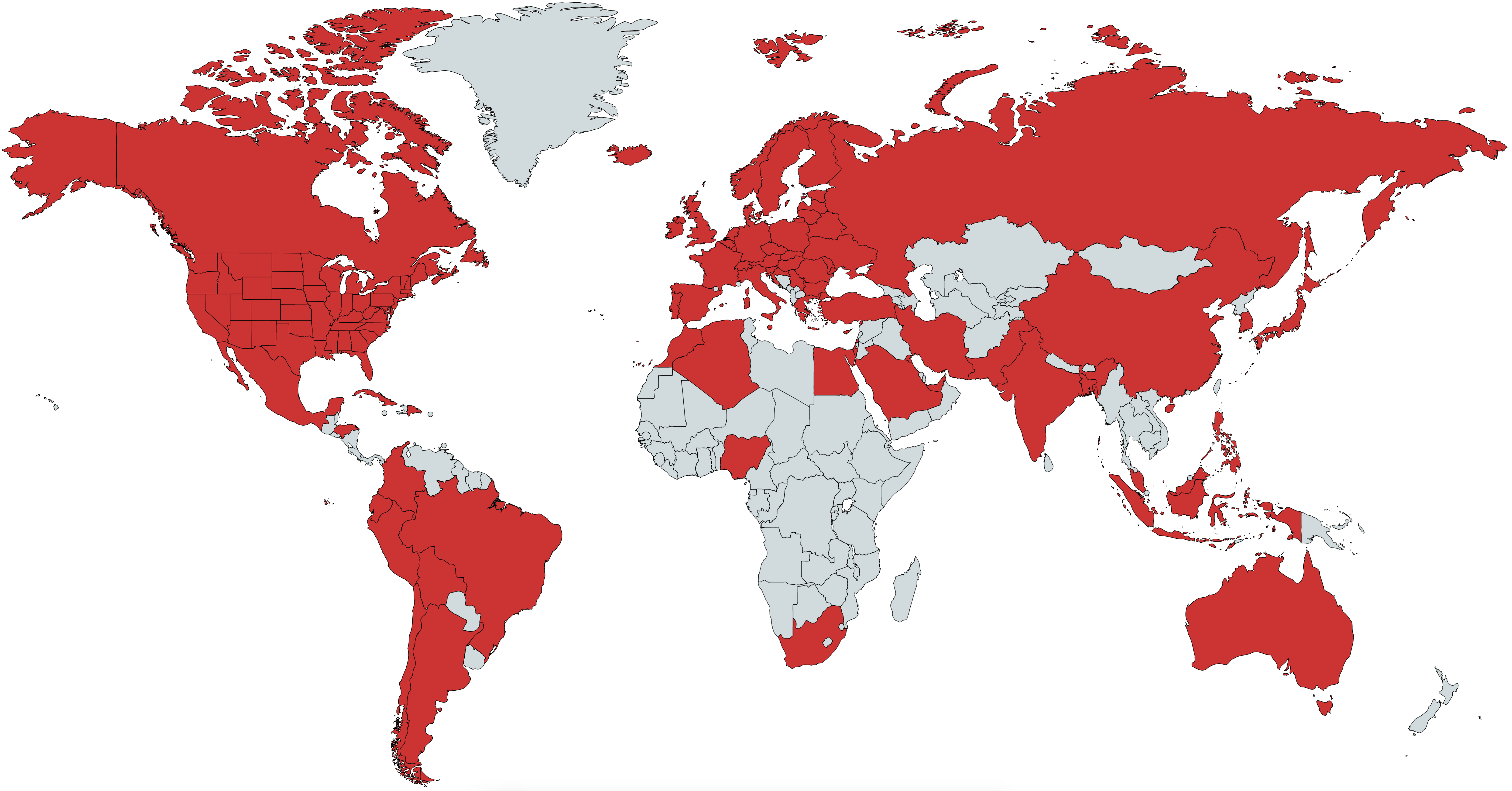
The goal of this project is to showcase the strengths of artificial intelligence to tackle one of the world’s most difficult problems: predict the track of a pandemic. Here, we use a pure data-driven approach by letting the machine do the learning. We are currently making projections for: the United States, all 50 US states (plus DC, PR, VI, GU, MP) and 70 countries (including all 27 EU countries). Combined, these 71 countries account for >95% of all global COVID-19 deaths. See map below for a visualization of countries we have projections for.
You can also directly access our US and global projections.
Additional Links
- Model Details - More in-depth description of how our model works.
- Estimating True Infections - Our findings regarding the relationship between true infections, reported cases, test positivity rate, and infection fatality rate for COVID-19.
- Youyang Gu August 13, 2020 Talk - Presentation from Youyang Gu about the model
Who We Are
covid19-projections.com is made by Youyang Gu, an independent data scientist. Youyang completed his Bachelor’s degree at the Massachusetts Institute of Technology (MIT), double majoring in Electrical Engineering & Computer Science and Mathematics. He also received his Master’s degree at MIT, completing his thesis as part of the Natural Language Processing group at the MIT Computer Science & Artificial Intelligence Laboratory. His expertise is in using machine learning to understand data and make practical, accurate predictions.
Click here for a more in-depth biography. You can contact him via his website or on Twitter.
Coverage Map
How Our Model is Different
-
Daily updates: Because our model is purely data-driven, it is quick to run and easy to regenerate. Unlike other models that are only updated only once every few days, our model is updated on a daily basis, leading to more accurate projections. We have generated daily projections since we began the project on April 1, 2020. No other model offers this level of update frequency.
-
No public funding: We are one of the only models used by the CDC that receives no public funding, making us a completely independent entity.
-
No conflicts of interest: Similar to the previous point, we are truly an independent entity that operates without outside influence or outside investors. Other groups may have collaborations with industry and government entities, or are developing their work for the purpose of publication. We only have one purpose: to create the most accurate projections.
-
Deaths data only: Our model only uses daily deaths data as reported by Johns Hopkins University. Unlike other models, we do not use additional data sources such as cases, testing, mobility, temperature, age distribution, air traffic, etc. While supplementary data sources may be helpful, they can also introduce additional noise and complexity which can notably skew results.
-
Minimal assumptions: Because our model uses machine learning to learn the inputs and parameters, we minimize the number of assumptions we have to introduce. This allows us to avoid certain biases that can be present when incorporating various assumptions.
-
Open data: We upload all of our raw data/projections daily onto our GitHub page. All of the data used on this website can be downloaded.
-
Open source: Our underlying SEIR model is open source.
-
Strong historical performance: We evaluate the performance of our model on a weekly basis. The code and data to evaluate models are also open-source.
-
Accounts for reopenings: We were one of the first models used by the CDC that factors in individual state-by-state or country-by-country reopenings, allowing us to make more realistic projections. Rather than pre-setting the type of reopening (e.g. full vs partial reopening), we allow our model to learn the effects based on the data.
-
Realistic simulations: Unlike other models that try to create complex mathematical equations to “fit a curve” or estimate the growth rate, we try to simulate the disease exactly how they progress in reality: we start off with the entire population in a region, then on each day a certain proportion becomes infected, and those individuals spread the infections to others, and so forth. This makes our model easy to interpret and understand.
-
Flexibility to create scenarios: Because of model’s realistic and flexible properties, we are able to generate varoius hypotheticals, such as what happens if everyone began social distancing one week earlier or one week later. We have also generated hypotheticals on what would happen in each region if there are no reopenings. A model that simply uses a curve fitting function or tries to track the growth rate will not be able to generate such hypotheticals.
-
Full disclosures of assumptions/limitations: We describe our assumptions and limitations in the sections below in order to be transparent about what our model can and cannot do. This is something we encourage all other models to provide in a clear manner.
-
Region-agnostic: Our model is agnostic to the region, enabling us to make projections for all 50 US states (plus DC, PR, VI, Guam), 30+ US counties, and 70+ countries. To our best knowledge, this is the most comprehensive public model in terms of coverage. Due to our machine learning layer, we also do not require manual tuning for each region, allowing us to focus our time on improving our projections.
-
No differential equations: Unlike traditional SEIR models, our model does not use differential equations. As a result, we can skip the significant computations required to solve systems of ordinary differential equations. Instead, we follow a more traditional discrete mathematics approach by using a discrete state machine with probabilistic transitions. All of the math in our model can be understood by a motivated high school student.
-
Fast: As a result of the simplicity described above, we are able to make fast computations using limited resources. We can generate all of our projections in under 30 minutes on a laptop.
-
Estimating testing targets: Because our model keeps an estimate of the number of newly infected individuals each day, we can use this estimate to determine a how many tests each region should ideally perform each day. We base our estimates on Harvard Global Health Institute’s study that assumes 10 contacts per infected individual. You can download our estimates here.
-
Learning the reproduction number (R): One of the most important properties for any infectious disease is the basic reproduction number, known as R. We are able learn the effective reproduction number over time and generate a plot of how the R value changes across all of our projections. Learn more about our R estimates below.
-
Learning the infection fatality rate (IFR): Rather than rely on various non-consensus studies on the infection fatality rate (IFR), our model can also learn the best value for the IFR in each region. Learn more about our IFR estimates below.
-
Learning when people started social distancing: It turns out that many people began social distancing before a region’s formal lockdown order is issued. Our model is able to learn the exact dates when people in a region started social distancing, which are often independent of the stay-at-home orders. For example, in New York, this inflection point is determined to be around March 14, 2020, which closely matches the NYC subway ridership data. For the US as a whole, we estimate that date to be around March 18, 2020. You can see what happens if everyone in the US reacted one week earlier (March 11, 2020) or one week later (March 25, 2020).
-
Strong validation system: Many of the other models tend to overfit to the data. We have a strong validation system to make sure that all of our updates pass out-of-sample validation before they can be included in the model. This allows us to better differentiate the signal from the noise and be more resistant to outliers. Because all of our assumptions and projections are tested/verified on all 50 states as well as over 70 countries, we are able to create more robust projections.
Historical Performance
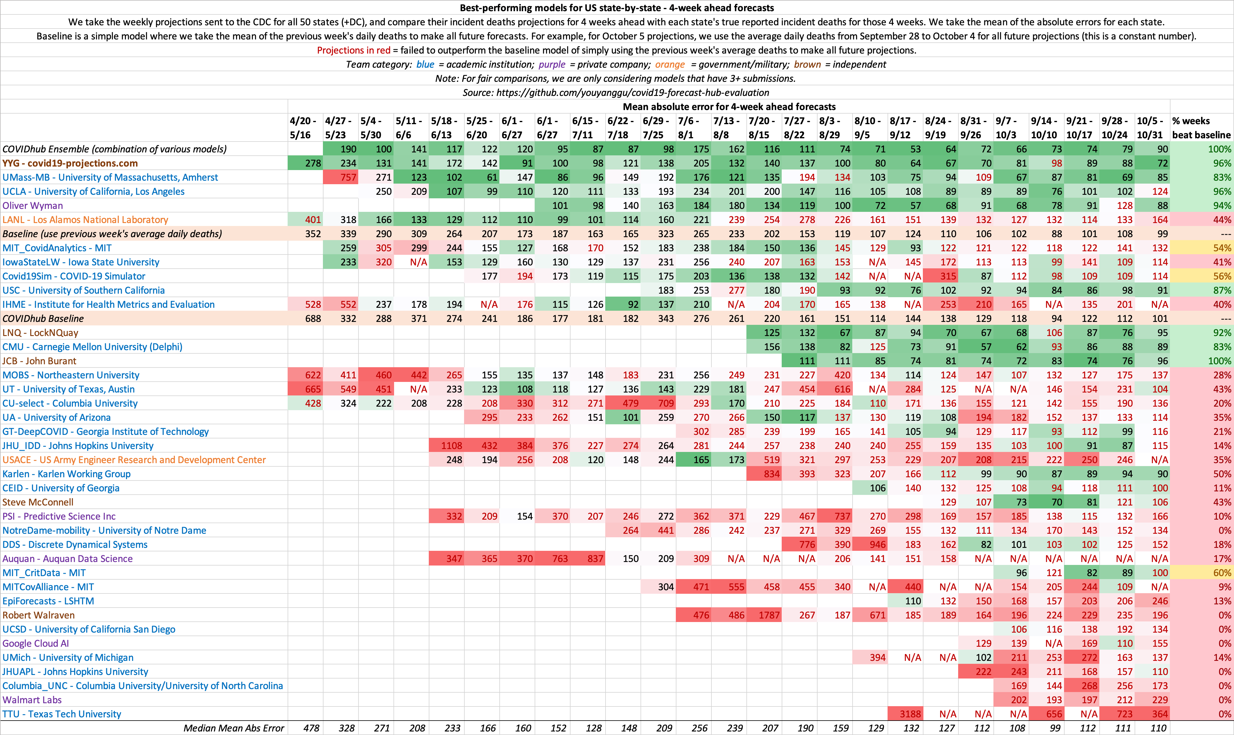
Last Updated: November 2, 2020 (See our GitHub repo for the most update-to-date evaluations)
A model isn’t very useful if it’s not accurate. Below is our analysis on how various models considered by the CDC have performed over the past few weeks. Because the CDC receives weekly projections from every Monday, we use projections from past Mondays to evaluate the models.
We have open-sourced the code and data used to evaluate COVID-19 models: https://github.com/youyanggu/covid19-forecast-hub-evaluation. We believe in a fully transparent evaluation methodology, and publicly releasing all of our code and data is the best way to do so. Learn more about our evaluation methodology on GitHub.
Click here to see our past weekly performance evaluations and for more explanations behind the evaluations. We believe it’s important to look at past evaluations to get a more comprehensive idea of model consistency/accuracy.
Evaluation of historical 4 week ahead US state-by-state projections
This is a metric that shows the consistency of model projections over the period of several months. 4 weeks ahead is long enough into the future that it requires non-trivial methods, yet short enough that it does not require excessive assumptions. Hence, we believe it is the ideal metric to compare models.
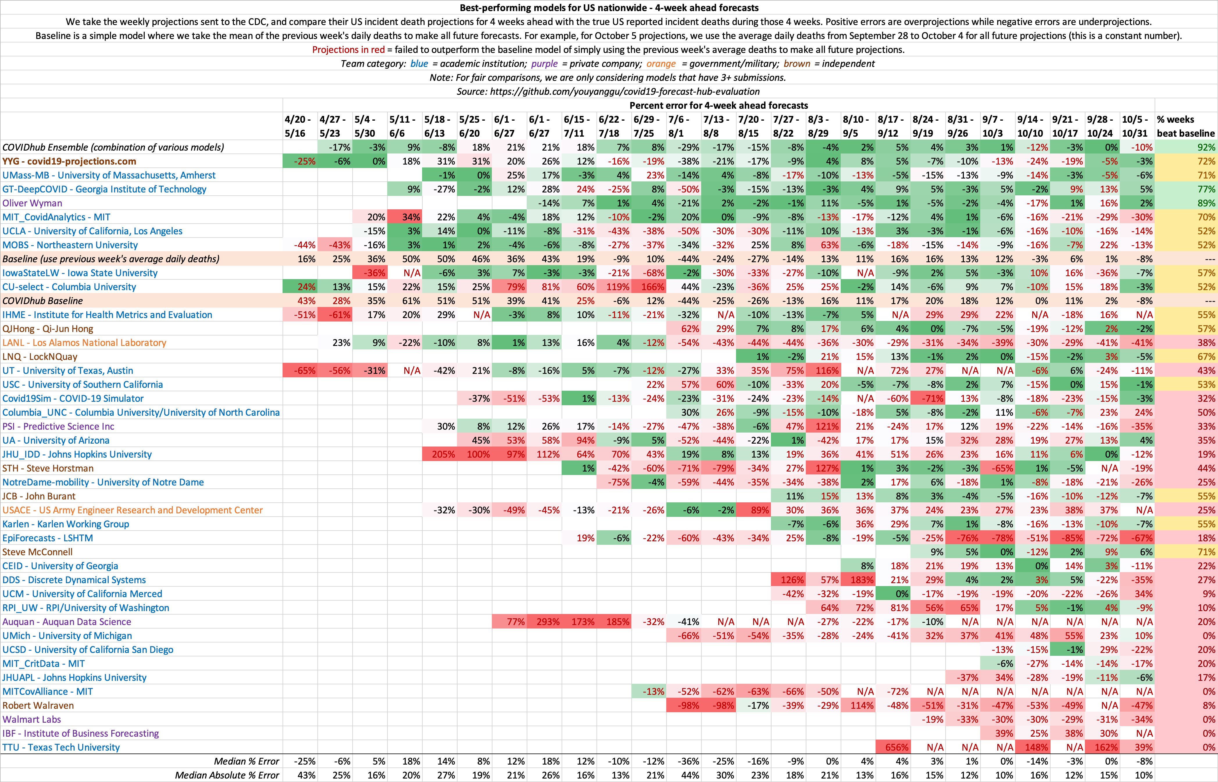
Evaluation of historical 4 week ahead US nationwide projections
Because US country-wide projections only contains a single forecast per week, there is much higher variance week-to-week compared to state-by-state projections, where there are 50+ forecasts each week. As a result, we believe state-by-state evaluations is a better indicator of model performance. This same concept is why we play 7-game series for NBA/NHL/MLB playoffs.
Comparison of October US Projections
We compare our last October 4, 2020 projections to that of the Institute for Health Metrics and Evaluation (IHME). To view additional comparison plots with IHME, click here.
Comparison of Late August US Projections
Below, we show our late August 2020 forecasts compared with IHME’s late August forecasts. To view additional comparison plots with IHME, click here.
Historical US Projections
Below, we show how our (C19Pro) US projections for August 4 and November 1, 2020 has changed over time, compared to IHME. Note that the true value on August 4, 2020 fell within our model’s confidence intervals over 90% of the time. To see our current US projections, click here.
To view additional comparison plots with IHME, click here.
CDC Projections Over Time
Below, we present our weekly CDC projections over time.
Data and Output
To make our projections, we use the daily death total provided by Johns Hopkins CSSE, what is considered by experts to be the “gold standard” reference data. We do not use case-related data in our modeling due to reasoning alluded to here. The only other data we use in the model is the population in each region. We periodically manually scan case and hospitalization data to help determine the bounds for our search grid.
While we do not use testing data in our model, we sometimes use US testing data from The COVID Tracking Project in our research and graphs.
Every day, raw daily projections for all 50 US states and select international countries will be uploaded onto our GitHub page. We are projecting future deaths as reported by Johns Hopkins CSSE.
Code
We have three public GitHub repositories:
- Projections Data and Website - Contains all model output data. Also contains the website source code (in the gh-pages branch)
- SEIR Simulator - The SEIR simulator behind our model. Learn more in our Model Details page.
- Model Evaluations - The full source code to replicate our model evaluations
Assumptions
Epidemiological Assumptions
We use a consolidation of resources provided by Models of Infectious Disease Agent Study (MIDAS) to set standard parameters such as incubation and infectious period. Most of these parameters have a wide consensus among experts. For example, we assume a 5-day incubation period (on average) and a 7-day infectious period (on average). These assumptions are probabilistic and roughly normally distributed. This means that an infected individual would be infectious between Day 2 to Day 8 after exposure, with Day 4-6 being the most infectious. For the purpose of calculating current infections, we assume an average individual is infected for 15 days. The exact values of the above parameters do not significantly change our projections.
Not everyone who are “currently infected” are infectious. To get a sense of the number of individuals that are infectious, we recommend dividing the “currently infected” number by half. To get the number of individuals who are at peak infectiousness, we recommend dividing the “currently infected” number by ~5.
Confidence Intervals
The future is not set in stone: a single policy change or a small change in the assumptions can cause a large impact in how the epidemic progresses. That’s why in addition to our mean estimate, we also provide a 95% confidence interval to reflect this uncertainty. For example, if we predict 150,760 deaths with a range of 88-294k, it means that we are 95% confident that the true deaths will be between 88-294k. Note that these confidence intervals are generated given that our above assumptions hold true. There are many real-world variables that can cause our assumptions to be inaccurate and affect the true outcome. We will try our best to address any inaccurate assumptions as time goes on.
In addition to the 95% confidence interval, we present the mean estimate. This value is usually higher than the median/most likely estimate because it is accounting for a longer tail on the higher end of the estimates. So for example, if our mean estimate for September 2020 US deaths is 180k, our median/most likely estimate may be 170k. This is because the upper bound of the deaths is technically unbounded, while the lower bound is bounded by the current death total. This causes a skew in the distribution of death projections, leading to a mean estimate that is higher than the median estimate.
Our daily deaths confidence intervals are meant to be looked at from a rolling mean basis, rather than a daily incident basis. For example, if a state reports deaths every other day (e.g. 0, 200, 0, 100), a confidence interval that covers daily incident deaths can only use [0, 200], which is not very informative. A confidence interval such as [55, 95] would be more informative, despite not overlapping with any of the four daily incident deaths. Hence, we recommend using a 7-day rolling mean when evaluating our confidence intervals.
We want to caution against focusing on one particular number as the outcome of this model. We are in fact projecting a range which includes a mean outcome. If the true results fall within the range, that is within the expected outcome of this model. When citing our projections, we highly recommend including our confidence intervals when referencing our projections (i.e. 21,342 (15-34k) deaths).
Social Distancing
-
US states: We assume heavy social distancing until the reopening date and moderate social distancing afterwards. We use the reopening date as outlined by the New York Times. For states with a staggered reopening, we use the date for which restaurants are allowed to reopen. For states where there is no concrete reopening date (states highlighted in yellow on the NYT map), we assume a reopening date of June 1, 2020. Reopening will likely cause a second wave of infections in states where the outbreak has not yet been fully contained.
-
European countries: We assume heavy social distancing until mid-May 2020 and moderate social distancing afterwards.
-
Non-US and Non-European countries: We try our best to keep track of when each country plans to reopen. If there is no news, we assume social distancing through August 2020.
Heavy vs moderate social distancing
Heavy social distancing is what many states and countries enacted in the initial stages of the epidemic: stay-at-home orders, closed non-essential businesses, etc. Infection rates typically decrease ~60%, going from an R0 of around 2-3 to an R of 0.6-1.0. As long as R, a measure of how many people an infected person infects on average, is less than 1, infections will decrease over time. If R is greater than 1, then the infection curve will rise. Hence, the ultimate goal is to keep R under 1.
Moderate social distancing is what we assume will happen once states and countries gradually begin relaxing their social distancing guidelines. Some establishments will reopen, but people will still be somewhat cognizant about maintaining social distancing. Most states and countries will have guidelines that aim to maximize social distancing and minimize close contact, such as enforcing capacity limits and recommending mask-wearing. We assume that infection rates will increase by approximately 0-30%, resulting in an R of around 0.8-1.2. This is based on analysis of R values in regions where there were no lockdowns, such as Sweden and South Dakota. Note that this is still a lower infection rate than what it was prior to the outbreak for most regions.
If regions impose stricter social distancing guidelines than our assumptions listed above, then we will likely see a lower infections and death rate than the current projections. Conversely, if regions impose looser guidelines, then we will likely see a higher infections and death rate. For example, if California reopens before June 1, 2020, there will be an increased chance of an earlier resurgence. Or if a state required all residents to wear masks, the likelihood of a steep increase in infections will decrease, according to some recent studies ([1], [2], [3]).
Second wave
In regions where the outbreak has not yet been fully contained, it is possible that reopening will cause a second wave of infections if states fail to maintain sufficient social distancing. We assume that regions that have reopened will take actions to reduce transmission, such as increased contact tracing, mandatory mask wearing, improved treatments, capacity limits, etc. Over time, the aforementioned actions, as well as the natural progression of the virus, will lead to a reduction in the transmission rate.
In states where a second wave is prevalent, infections appear to reach a peak before undergoing a decline, despite a lack of concrete mitigation measures. One theory is that there is a certain subset of the population that are more susceptible to contracting the virus (old age, co-morbidities, unwillingness to take precautions, etc). Once that group is exhausted, it becomes harder for the virus to spread, leading to a decline in transmission despite no government intervention. Note that this is merely a theory to explain the observed data.
As of June 1, 2020, our model no longer assumes a second lockdown.
Post-reopening
After the initial ramp-up period of a reopening (1-2 months), we assume that the spread will decrease over time due to improvements in contact tracing, increased mask wearing, greater awareness within the population, and increased population immunity. In the initial stages of the reopening, this phenomenon will likely be dwarfed by the act of the reopening itself, hence leading to a plateau or increase in cases. But after the rate of reopening for a region has plateaued 1-2 months later, we expect to see a gradual decline in transmission and hence a decline in infections and deaths. Of course, this assumption is highly subject to change based on the data.
Looking at the data, we noticed that as various states reach 10-35% prevalence, infections begin to slow down, despite no significant interventions. This seem to suggest that the effective herd immunity threshold under the current conditions of social distancing and intervention measures may be lower than the 60-80% values previous reported in March/April. Nevertheless, it’s important to note that transmission does not stop once HIT is reached - it simply slows down. See our write-up, Estimating True Infections, for a more in-depth analysis on this topic.
Starting on July 22, 2020, we use two logistic (sigmoid) functions to approximate the R_t curve from the reopening. We use two parameters, the maximum reopen R_t and the inflection rate to determine the shape. These two parameters are then learned by our machine learning layer based on the data. You can learn more by looking at our open-source code.
Prior to July 22, 2020, we assume a very small daily decay in the transmission rate (R) starting from roughly 30 days after reopening (~0-0.5%). The decay is compoundly applied until the R drops below 1, at which point we stop applying further decays. As the exact value of the decay is unknown ahead of time, we initially sample this decay from a random distribution. As time goes on and we obtain more data regarding the post-reopening effects, our model will learn this decay.
Fall Wave
The future is uncertain, and many things can happen between now and fall that will change the trajectory of this epidemic. While we believe a September increase in deaths is unlikely, we do think it is possible that the rate of transmission may increase as we head towards winter. A few reasons for that include: seasonality of the virus, more time spent indoors, increased mobility as schools reopen and people return to work, and the potential loss of acquired immunity.
We currently assume a 0-0.5% daily increase in the transmission rate (R_t) starting in the end of summer (August). Initially, we randomly sample this value from a triangle distribution in our simulations. This results in a wider confidence interval to account for the increased uncertainty. As more data comes in over time, our machine learning algorithm will be able to better learn this value. It’s important to recognize that while a fall wave is very likely, that severity of the wave is still very much uncertain.
We do not explicitly model school reopenings, but as of our late September update, we are incorporating an increase in the infection rate due to school reopenings. It is still unclear to what extent this will translate to deaths.
We are currently not changing the infection fatality rate (IFR) from the summer. But there has been studies (Kifer et al.) showing that the fatality rate may increase during the winter months due to factors such as lower indoor humidity.
Because our point estimates are mean estimates rather than median estimates, it is possible for our Rt mean estimates to remain below 1 while the new infections mean estimates increase (due to the skewness of the distribution).
Infections Estimate
The current and total infections estimates in our projections are at the core of our SEIR model. We use those estimates to make forecasts regarding future deaths according to the specifications of the SEIR model. The total infections estimate includes all individuals who have ever been infected by the virus, including asymptomatic individuals as well as those who were never tested. The current infections estimate is based on how many people are currently infected at that time point (total - recovered). To compute current infections, we assume that individuals are infected for an average of 15 days. We estimate that the true number of total infections is likely 5-15x higher than reported cases for most regions.
Effective Reproduction Number (R)
One of the most important properties for any infectious disease is the basic reproduction number, known as R0. Rather than pre-setting this value based on assumptions, our model is able to learn the value that most closely matches the data. For Italy, the R0 is found to be around 2.4-2.8, while for New York City, the R0 is 5.4-5.8. This means that on average, an infected person in New York City will infect 5.4 to 5.8 additional people. For most regions, the R0 is found to be around 2, which matches the WHO findings. We are able to generate a plot of how the R value changes over time for all of our projections. To see our estimates of R values for every state and country, see our Infections Tracker page.
Our R estimates are merely estimates rather than precise values, and is only based on deaths data. We correct for reporting lags, so how deaths are changing today is a reflection of how the R value was changing 3-4 weeks ago. We then apply additional assumptions explained in this section to interpolate the R value since then. As a result, the current R value estimates are more of a byproduct of our assumptions than a result of any measurable data. As we receive more data in the future, we then update our R estimates to most closely reflect the observed data.
Rt.live is a good resource for looking at R_t estimates using case data rather than deaths data.
Infection Fatality Rate (IFR)
Note that our IFR estimates is subject to change based on new data. The exact IFR value does not significantly affect our death estimates.
See our writeup, Estimating True infections Revisited, for our in-depth analysis on the infection fatality rate and its relationship with cases, deaths, and test positivity rates.
We estimate that infection fatality rate (IFR) for COVID-19 in the US through April is between 0.9-1.2%. This matches a May 7, 2020 study that estimates the IFR to be slightly less than 1.3% after accounting for asymptomatic cases. We also found that most countries in Europe (with the the exceptions of United Kingdom, Spain, and Eastern Europe) have an IFR closer to 0.75%, which matches this May 6 study.
Prior to June 2020, we use the following initial IFR in our projections:
- 0.75% IFR: Japan, South Korea, Iceland, Norway, Switzerland, all EU countries except Spain
- 1% IFR: US and all other countries
Since June 1, 2020, we use a variable IFR that decreases over time to reflect a lower median age of infections, improving treatments, and possible seasonality of the virus. Hence, we decrease the initial IFR linearly over the span of 3 months until it is 30% of the original IFR. The initial IFR for reach region is determined by looking at the case fatality ratio and median age, and ranges from 0.3%-1.5%. For example, we estimate the initial IFR in New York state is 1.25%, while the initial IFR in Utah is 0.4%. Through the end of April, we estimate the IFR in the US to be around 0.7%, which is corroborated by CDC’s best estimate scenario, which cites a study from April. By August 2020, we estimate an implied IFR of 0.2-0.4% in most of the US and Europe. For later-impacted regions like Latin America, we wait an additional 3 months before beginning to decrease the IFR. After the summer, we gradually increase the IFR by ~0.2% per day to account for the shifting age distribution and the potential seasonality of the virus.
We want to note that our IFR estimate is based on reported deaths, rather than true deaths. Since the US and many other regions around the world regularly underreport COVID-19 deaths, our IFR estimates is likely to be a lower bound for the true IFR. Once you adjust for age and account for “true” deaths (such as by looking at excess deaths), the true IFR can be much higher. Hence, for the US, even though we use an implied IFR of ~0.3% in our modeling for the 2020 summer wave, we believe that the true IFR is closer to 0.4-0.7%.
Data from the first half of 2020 for global (#2), Europe, and US IFR estimates point to a 0.5-1% IFR to be a reasonable estimate. One of the largest antibody studies thus far estimated a 1.2% IFR for Spain. Since those studies have been published, it is possible that IFR has lowered due to improved treatments.
We include asymptomatic individuals in our estimates, as they can also be infectious. CDC and other studies (#2) have shown that there is “no statistically significant difference in the viral load of symptomatic versus asymptomatic infections”. Other recent studies suggest that asymptomatic individuals may be slightly lesss infectious, but not by much. Note that asymptomatic individuals are different than pre-symptomatic individuals.
Undetected Deaths
In our June 15, 2020 model update, we incorporated the concept of undetected deaths to better estimate the number of true infections in the early stages of the pandemic. In the first weeks of the pandemic for each region, we assume a significant percentage of deaths will be undetected/unreported due to a lack of testing. We assume that this percentage will decrease over time until it reaches a negligible amount. So if there are 100 true deaths and 20% are undetected, then only 80 deaths will be reported/projected. While it is possible that the undetected deaths ratio may be higher, the exact value does not signficantly affect our projections.
As a result of this update, the number of true infected individuals in our projections have increased. However, we believe that even after this update, that we are still undercounting the true deaths in a region.
For further analysis of “excess deaths”, see official CDC data, reporting by The New York Times, Financial Times, or The Economist.
Limitations
We want to be as clear as possible regarding what our model can and cannot do. While we try our best to make accurate projections, no model is perfect. Here we present some of the known limitations of our model.
Data Accuracy
A model is only as good as the data we feed it. If the data is not accurate, then it would be difficult to make accurate projections downstream. We only use official reported deaths in our modeling.
School Reopening
While we factor in a fall wave in our projections that may result in an increase in transmission, we do not explicitly model school reopenings. As of August 2020, it is still unclear what the effect of school reopenings will be, and how it will differ from district to district and from state to state. We want to wait until we have more data before incorporating this phenomenon into our model.
Death Reporting and Excess Deaths
Some countries report probable deaths while others only report laboratory-confirmed deaths. This difference explains why countries with comprehensive reporting like Belgium have the highest death rates.
On June 8, 2020, the Washington Post published an investigation showing that “at least 24 [US] states are not heeding the national guidelines on reporting probable cases and deaths, despite previously identifying probable cases in other national outbreaks.” We made a series of Tweets about it here.
Differences in how countries/states report deaths can lead to unfair comparisons and also skew projections. For example, New York City reported close to 5,000 probable deaths between April 14-23, 2020, but have not reported any probable deaths since. This was an increase of 30% over the existing death total at the time. As a result, early April 2020 projections under-projected the number of deaths for New York, while our late April and early May 2020 projections over-projected the number of deaths for New York.
Because the accuracy of our projections rely on consistent reporting of deaths, any inconsistencies may skew our projections.
While we attempt to predict the official death total, the true death total will be higher due to underreporting at various levels. The New York Times, The Economist, and the Financial Times are currently tracking these excess deaths. Also see work by the Weinberger Lab at Yale School of Medicine.
Additional Limitations
-
Day-of-week factors: We currently do not account for day-of-week factors in death reporting. According to our analysis, deaths reported on Sunday/Monday are about 60% of that of Tuesday-Thursday. So we expect on average that our projections will be higher than Sunday/Monday reports and lower than our Tuesday-Thursday reports.
-
Confidence intervals: Due to the aforementioned day-of-week factors and various reporting noises (e.g. states sometimes report 0 on one day and make up for it on the next day), we recommend smoothing daily reported deaths before comparing them to our daily confidence intervals.
-
Data frequency: Because our model uses only the daily death totals from each region to make projections, it will be more effective for regions where there are more available deaths data (such as New York) than regions where there are only a few reported deaths (such as Wyoming).
-
Summer seasonality: In the spring, we did not explicitly factor in seasonality changes. A May 8, 2020 study of 144 geopolitical areas finds no significant correlation between temperature and transmission. However, if seasonality effects are reflected in the data, we will implicitly factor it in. It is possible that the effects of warmer temperatures may be partially offset by lockdown fatigue.
-
Lockdown fatigue / holidays: As shown in various mobility data and our analysis of the NYC subway data, an increasing number of people have been moving around in the weeks following a lockdown. This may contribute to an increase in infections in the weeks following the lockdown/mitigation. Similarly, holidays may be a source of “superspreader” events, which we currently do not explicitly incorporate.
-
Testing data: In May 2020, there were various reports regarding the accuracy and integrity of data that some US states have been reporting (e.g. see The Atlantic and Associated Press). We express similar concerns, and hope that states will do their best to report accurate data.
-
Reporting differences: Different countries follow different guidelines on how they are reporting COVID-19 deaths. For example, Belgium is one of the most comprehensive countries when it comes to death reporting: they report all probable deaths as well as nursing home deaths. In contrast, United Kingdom only began including care home deaths starting on April 29, 2020, having only reported hospital deaths previously. Because we are projecting future reported deaths, our model assumes that the reporting guidelines remains constant for each country.
-
Reporting delay: There is a delay between when a death occurs and when it is reported to the local/state health department. This delay can range anywhere from 1 day to over 30 days, although the vast majority of deaths are reported within 10 days. Prior to July 22, 2020, we do not explicitly incorporate this reporting delay. But starting July 22, 2020, we began to include this delay in our modeling. We assume that ~50% of deaths are reported within 5 days and ~80% of deaths are reported within 10 days.
-
End date: We are only making projections for a few weeks to a few months ahead, but this does not mean that the epidemic will stop afterwards. Deaths will continue to rise even after we stop making projections.
-
Asymtomatic individuals : Our model is based on infectious individuals only. It’s unclear to what degree asymptomatic individuals are infectious.
-
International projections: Our model was created and optimized for the United States. We include our projections for over 70 countries, but we want to caution that the model was not optimized for international countries. So if you plan on citing our model’s international projections, please be sure to also consult each country’s health experts.
-
Affecting the future: Our projections are not set in stone and do not exist in a vacuum. If everyone saw our projections and heeded the advice of experts to continuously practice social distancing, the infections and deaths will decrease over time, leading to a final tally that is lower than our projection. That does not mean that our projection were “wrong”. In fact, our greatest hope is the scenario described above where we can help prevent future infections and deaths, causing our projections to be an overestimate. For example, a early March 2020 Imperial College study estimated that 2.2 million people would die in the US if mitigations were not implemented. This helped lead to a wave of lockdowns and stay-at-home orders, thereby significantly reducing deaths. That does not mean that the Imperial College study was “wrong” - their study helped shape the outcome of the future.
While we attempt our best to ensure accuracy and precision, no model is perfect, so we urge everyone to use caution when interpreting these projections. This is just one particular model, so we encourage everyone to evaluate and be open to multiple sources. At the end of the day, the decision-making rests in the hands of people, not machines.
Concerns with the IHME model
In this section we will compare our projections with a popular model developed by the Institute for Health Metrics and Evaluation (IHME) and commonly referred to by the White House and media. We also share some of our original concerns with the model that partially inspired us to create our own.
We present a series of Tweets highlighting the issues with the IHME model:
Sep 15
Sep 11
July 3
June 29
June 21
June 12
May 9
April 20
April 12
Below, you can find a comparison of our past projections (C19Pro) with IHME for the US, New York, New Jersey, and California, some of the most heavily impacted regions. You can find comparisons of late May projections in the Historical Performance section. Click here to view additional comparison plots.
As you can see from the graphs above, IHME’s projections have historically failed to accurately capture the true trajectory for these regions. Below, we will go into further details as to why IHME has been and still is a flawed model.
There are existing news articles such as Vox, STAT News, CNN, and Quartz that agree with our concerns.
In the words of Ruth Etzioni, an epidemiologist at Seattle’s Fred Hutchinson Cancer Research Center, “that [the IHME model] is being used for policy decisions and its results interpreted wrongly is a travesty unfolding before our eyes.”
Baseline Comparison: C19Pro vs IHME
If on June 1, 2020, you simply assume each state/country’s average daily deaths from the week before will be unchanged for the next 4 weeks, you can make a better forecasts than IHME. This is equivalent to extending a straight line on the daily deaths plots.
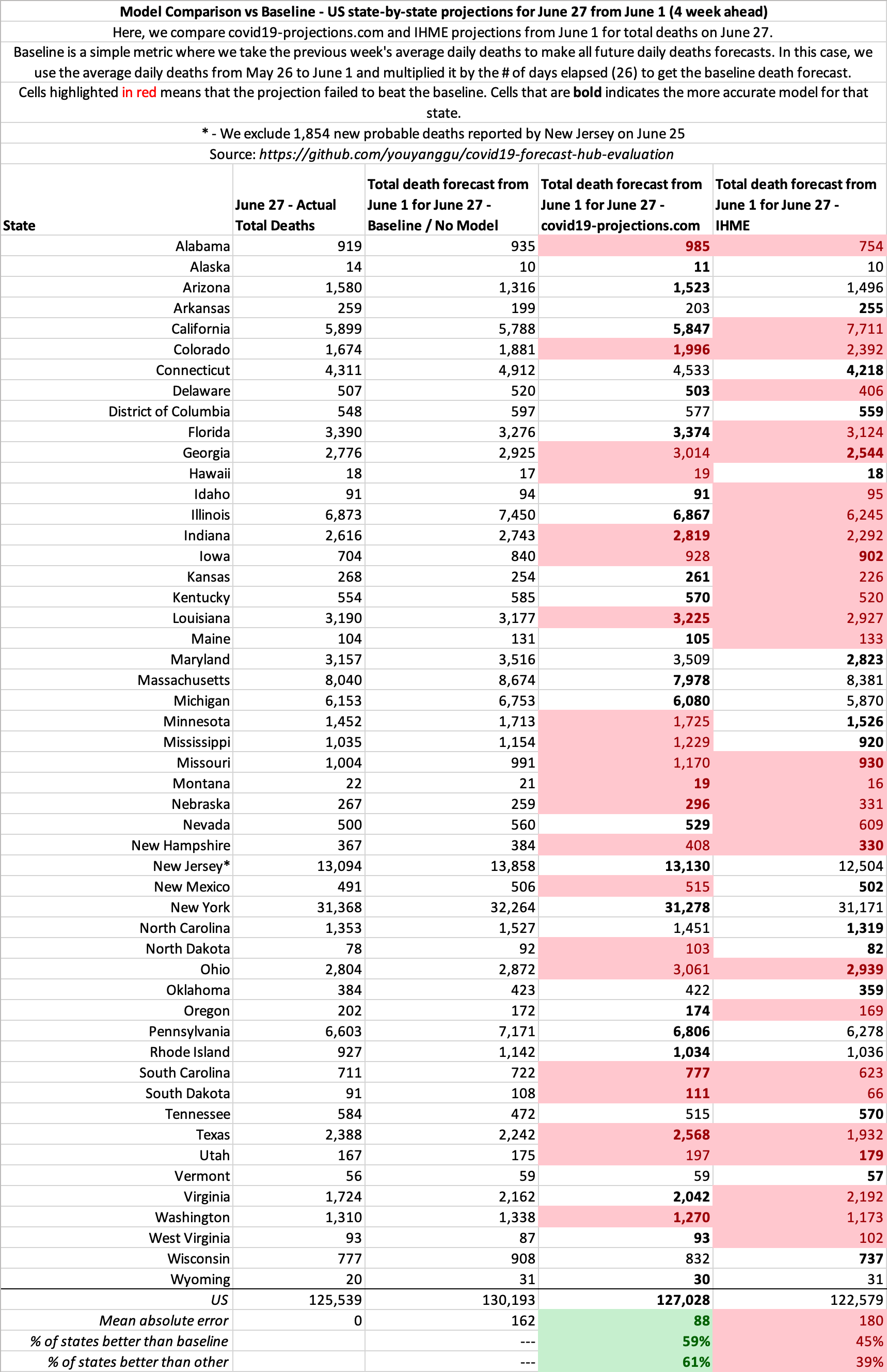
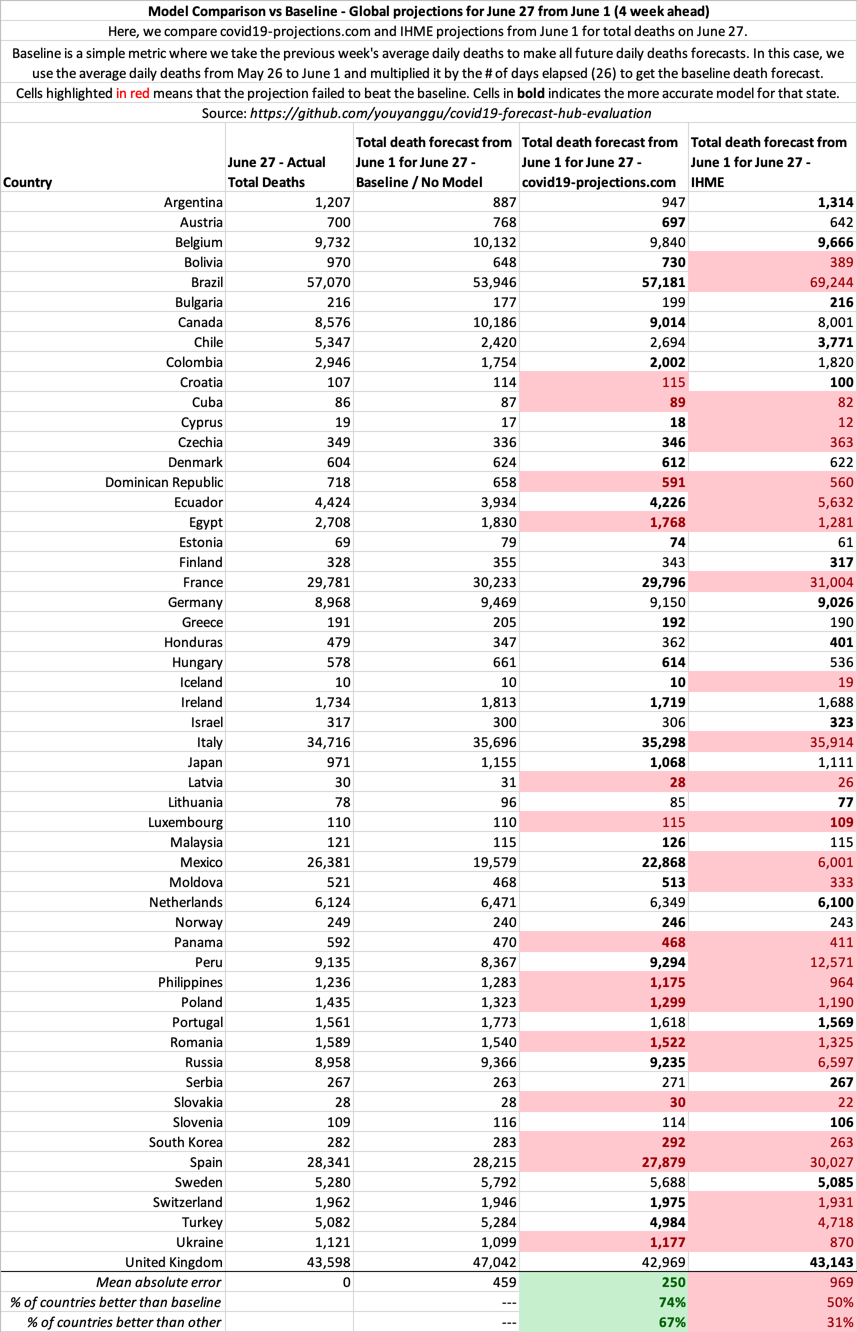
The pattern is similar for other dates as well. See our open source evaluation for more.
Late May Projections
Below you can find some of our late May 2020 projections for 4 of the most heavily impacted states since reopening: Florida, California, Arizona, Texas.
Click here to view more plots of historical projections.
Comparison of Data Sources
Here is a comparison of the data sources we use in our model versus what IHME uses (from their June 11, 2020 press release). More is not always better.
| covid19-projections.com | IHME |
|---|---|
| Daily deaths | Daily deaths |
| Case data | |
| Testing data | |
| Mobility data | |
| Pneumonia seasonality | |
| Mask use | |
| Population density | |
| Air pollution | |
| Low altitude | |
| Annual pneumonia death rate | |
| Smoking data | |
| Self-reported contacts |
May 4 Revision
On May 4, 2020, IHME completely overhauled their previous model and increased their projections from 72k to 132k US deaths by August 2020. Whereas they were previously underprojecting, they are now overprojecting the month of May. At the time of their new update on May 4, there were 68,919 deaths in the US. They projected that there will be 17,201 deaths in the week ending on May 11. In fact, there were only 11,757 deaths. IHME overshot their 1-week projections by 43%. Meanwhile, we projected 10,676 deaths from May 4 through May 11, an error of less than 10%.
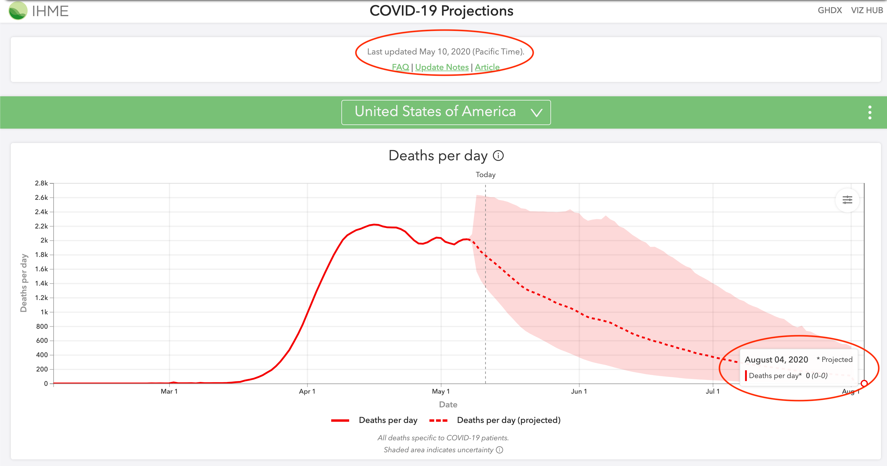
IHME went from severely underprojecting their estimates to now overprojecting their estimates, as you can see in the below comparison of May 4, 2020 projections. Furthermore, as recently as May 12, they were still projecting 0 deaths by August 4. Their model should not be relied on for accurate projections.
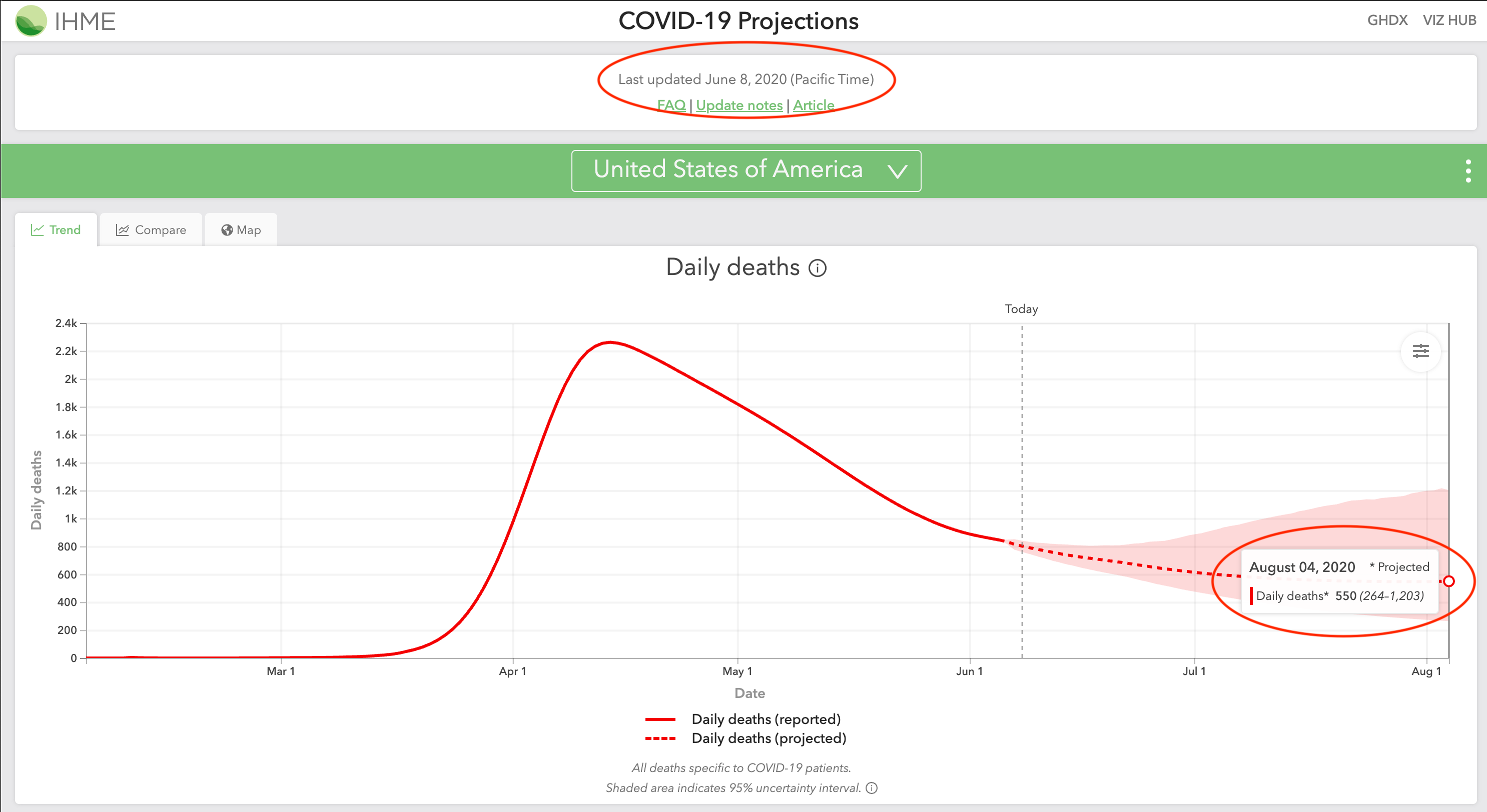
June 8 Revision
On June 8, 2020, IHME again revised their model to show a more realistic August 2020 projection. Their projections for August 4 increased from 0 (0-0) deaths in their May 10 projections to 550 (264-1203) deaths in their revised June 8 projections.
June 10 Revision
In their June 10, 2020 update, IHME is projecting deaths to decrease from June through August 2020, and then increase from 400 deaths per day on September 1 to 1,000 deaths per day on October 1. Their press release headline is titled: “IHME models show second wave of COVID-19 beginning September 15 in US”. They cite back-to-school and “pneumonia seasonality” as reasons for this fall spike.
Pneumonia/influenza deaths are actually the lowest in August and September, according to the CDC. The same pattern holds true for bacterial pneumonia. Regarding back-to-school, schools in Europe have managed to successfully reopen with no rise in cases. Furthermore, children (age <18) account for less than 2% of all reported COVID-19 cases. Hence, it makes little sense for deaths to decrease when all of America goes back to work, but for deaths to increase when children go back to school.
Sample Summary of IHME Inaccurate Predictions
In their April 15, 2020 projections, the death total that IHME projected will take four months to reach was in fact exceeded in six days:
| April 21 Total Deaths | IHME Aug proj. deaths from Apr 15 | Our Aug proj. deaths from Apr 15 | |
|---|---|---|---|
| New York | 19,104 | 14,542 | 33,384 |
| New Jersey | 4,753 | 4,407 | 12,056 |
| Michigan | 2,575 | 2,373 | 8,196 |
| Illinois | 1,468 | 1,248 | 4,163 |
| Italy | 24,648 | 21,130 | 40,216 |
| Spain | 21,282 | 18,713 | 31,854 |
| France | 20,829 | 17,448 | 41,643 |
As you can see above, their models made misguided projections for almost all of the worst impacted regions in the world. The most alarming thing is that they continue to make low projections. Below is their projections from April 21, 2020. All of the below projections were exceeded by May 2, just a mere 11 days later:
| May 2 Total Deaths | IHME Aug proj. deaths from Apr 21 | Our Aug proj. deaths from Apr 21 | |
|---|---|---|---|
| New York | 24,198 | 23,741 | 35,238 |
| New Jersey | 7,742 | 7,116 | 13,651 |
| Michigan | 4,021 | 3,361 | 6,798 |
| Illinois | 2,559 | 2,093 | 6,653 |
| Italy | 28,710 | 26,600 | 44,683 |
| Spain | 25,100 | 24,624 | 31,854 |
| France | 24,763 | 23,104 | 41,643 |
As scientists, we update our models as new data becomes available. Models are going to make wrong predictions, but it’s important that we correct them as soon as new data shows otherwise. The problem with IHME is that they refused to recognize and update their wrong assumptions for many weeks. Throughout April, millions of Americans were falsely led to believe that the epidemic would be over by June because of IHME’s projections.
On April 30, 2020, the director of the IHME, Dr. Chris Murray, appeared on CNN and continued to advocate their model’s 72,000 deaths projection by August. On that day, the US reported 63,000 deaths, with 13,000 deaths coming from the previous week alone. Four days later, IHME nearly doubled their projections to 135,000 deaths by August. One week after Dr. Murray’s CNN appearance, the US surpassed his 72,000 deaths by August estimate. It seems like an ill-advised decision to go on national television and proclaim 72,000 deaths by August only to double the projections a mere four days later.
Unfortunately, by the time IHME revised their projections in May 2020, millions of Americans have heard their 60,000-70,000 estimate. It may take a while to undo that misconception and undo the policies that were put in place as a result of this misleading estimate.
US June-August
As late as May 3, 2020, IHME projected 304 (0-1644) total deaths in the US from June 1 to August 4, a span of two months. The US reported 768 deaths on June 1. So a single day’s death total exceeded IHME’s estimate for two months.
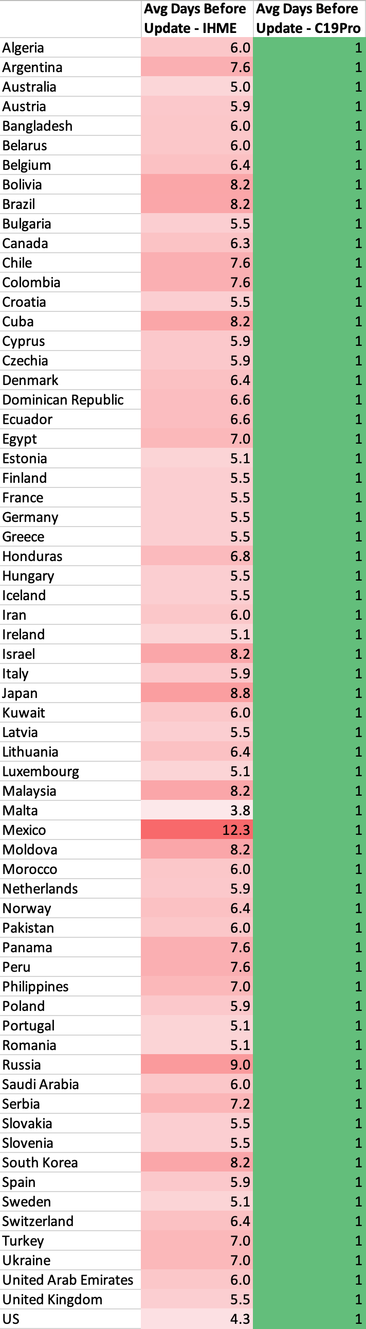
Update time
New data is extremely important when making projections such as these. That’s why we update our model daily based on the new data we receive. Projections using today’s data is much more valuable than projections from 2-3 days ago. However, due to certain constraints, IHME is only able to update their model 1-2 times a week: “Our ambition to produce daily updates has proven to be unrealistic given the relative size of our team and the effort required to fully process, review, and vet large amounts of data alongside implementing model updates.”
Mobility Data
On April 17, 2020, IHME stated that they are incorporating new cell phone mobility data which indicate that people have been properly practicing social distancing: “These data suggest that mobility and presumably social contact have declined in certain states earlier than the organization’s modeling predicted, especially in the South.” As a result, IHME lowered their projections from 68k deaths to 60k deaths by August. Their critical flaw is that they assume a linear relationship between lower mobility and lower infection - this is not the case.
Most transmissions do not happen with strangers, but rather close contacts. Even if you reduce your mobility by 90%, you do not reduce your transmission by 90%. The data from Italy shows that it only reduces by around 60%. That’s the difference between 20k and 40k+ deaths. IHME was likely making the wrong assumption that a 90% reduction in mobility will decrease transmission by 90%. Here is a compilation from infectious disease expert Dr. Muge Cevik showing that household contacts were the most likely to be infected.
We posted a Tweet on April 11 about MTA (NYC) and BART (Bay Area) subway ridership being down 90% in March. However, the deaths have only dropped around 25% in NY, while CA has yet to see sharp decrease in deaths in April, more than a month after the drop in ridership.
Interestingly, after IHME suddenly revised their projections from 72k to 130k on May 4, the director of IHME offered this explanation for why they raised their estimates: “…we’re seeing just explosive increases in mobility in a number of states that we expect will translate into more cases and deaths.” This is directly contradictory to their press release just 2 weeks earlier stating that mobility has been lower than predicted. Any 2-week differences in mobility should not explain this sudden jump in projections - only a flawed methodology would.
State Reopening Timeline
In their April 17, 2020 press release, IHME released estimates of when they believe each state will have a prevalence of fewer than 1 case per 1 million. They noted that 35 states will reach under 1 prevalent infection per 1 million before June 8, and that “states such as Louisiana, Michigan, and Washington, may fall below the 1 prevalent infection per 1,000,000 threshold around mid-May.”
As of May 15, 2020, Louisiana, Michigan, and Washington are reporting 30-90 confirmed cases per million each day. Furthermore, prevalent infections are 5-15x higher than reported cases since most cases are mild and thus not tested/reported. As a result, we estimate Louisiana and Michigan to have around 7,000 prevalent infections per million, which is 7,000 times higher than IHME’s April 17 estimates. An analysis for many of the remaining states show a similar high degree of error. Hence, IHME’s estimates have been off by a factor of more than 3 orders of magnitude.
Unfortunately, it is likely that many individuals and policy-makers used IHME’s misguided reopening timelines to shape decisions with regards to reopening. Their reopening timelines were picked up and widely disseminated by many media outlets, both local and national. Any policies guided by these estimates can have repercussions weeks and months down the road.
Technical Flaw
Prior to their May 4, 2020 complete overhaul of their model, the IHME model was also inherently flawed from a mathematical perspective. They try to model COVID-19 infections using a Gaussian error function. The problem is that the Gaussian error function is by design symmetric, meaning that the curve comes down from the peak at the same rate as it goes up. Unfortunately, this has not been the case for COVID-19: we come down from the peak at a much slower pace. This leads to a significant under-projection in IHME’s model, which we have thoroughly highlighted. University of Washington Professor Carl T. Bergstrom discussed this in more detail in this highly informative series of Tweets.
Click here to see how our projections have changed over time, compared with the IHME model. For a comparison of April projections for several heavily-impacted states and countries, click here.
To conclude, we believe that a successful model must be able to quickly determine what is realistic and what is not, and the above examples highlights our main concerns with the IHME model.
Online Coverage
Selected Articles. Includes coverage through October 2020
National
- Wall Street Journal - Oct 23
- Bloomberg - Oct 21
- Business Insider - Sep 29
- CNBC - Sep 24
- The Hill - Sep 24
- ProPublica - Sep 14
- Business Insider - Sep 12
- The Atlantic - Sep 9
- Yahoo News - Sep 9
- CNBC - Sep 4
- Washington Post - Aug 26
- Bloomberg - Aug 13
- Washington Post - Jul 23
- ProPublica - Jul 21
- StatNews - Jul 21
- AFP - Jul 15
- Bloomberg - Jul 1
- AFP - Jun 12
- NPR - Jun 11
- CNN - Jun 8
- The Economist - May 21
- The Wall Street Journal - May 21
- New York Times - May 12
- NPR - May 7
- MarketWatch - May 6
- CNN - May 5
- New York Times - May 5
- The Wall Street Journal - May 5
- USA Today - May 1
- StatNews - Apr 30
- TheHill - Apr 30
- New York Post - Apr 29
- CNN - Apr 28
Magazines/General News
- New York Magazine - Oct 12
- The New Yorker - Oct 1
- Reason - Sep 29
- IEEE Spectrum - Sep 22
- The Street - Aug 30
- New York Magazine - Aug 17
- MIT Technology Review - Aug 11
- New York Magazine - Aug 9
- Reason - Jul 20
- Vox - Jul 16
- GQ - Jun 18
- IEEE Spectrum - Jun 11
- GeekWire - Jun 9
- Reason - May 28
- Bustle - May 22
- The Bulwark - May 21
- Harvard Global Health Institute - May 10
- Reason - May 1
Local
- The Advocate (NOLA) - Sep 10
- Washington Examiner - Aug 19
- Milwaukee Journal Sentinel - Aug 17
- Miami Herald - Aug 14
- The Advocate (NOLA) - Aug 11
- SF Gate - Aug 10
- WPTV - West Palm Beach - Jul 2
- The Mercury News - Jun 25
- The Advocate (NOLA) - Jun 17
- The Mercury News - May 26
- The Mercury News - May 4
- Seattle Times - Jun 11
- Seattle Times - May 3
- Star Tribune - May 13
- Boston 25 News - Jun 4
- Newsday - Jun 4
- Courthouse News - May 6
- KUOW-FM - May 18
- Arizona Republic - Jun 9
- ABC15 Arizona - Apr 21
- The Center Square - May 28
International
- Financial Review (Australia) - Oct 7
- Huffington Post (France) - Oct 2
- El Pais (Spain) - Oct 2
- World Journal (Chinese) - Sep 26
- El Universal (Mexico) - Aug 17
- La Tercera (Chile) - Jun 22
- CNN Chile - Jun 23
- Reforma (Mexico) - May 28
- Alto Nivel (Mexico) - May 21
- Univision (Mexico) - Jun 9
- Mexico Desconcido - May 24
- Paris Match (France) - Jun 10
- Outlook India - Jun 21
Others
- Centers for Disease Control and Prevention (CDC)
- FiveThirtyEight
- Our World in Data
- California COVID Assessment Tool
- Wikipedia
How to Cite
Gu, Y. COVID-19 projections using machine learning. https://covid19-projections.com. Accessed <ACCESS_DATE>.
Updates
2020-10-05
- Final model update (using data from 2020-10-04). For more information, read Youyang Gu’s blog post. Follow @youyanggu on Twitter for continued COVID-19 insights. Thank you for your support over the past year.
2020-07-22
- We released a major update that tries to better account for increases in cases and deaths from the reopening. See Update Notes on Twitter
2020-07-08
- Extended projection end date from October 1 to November 1
2020-06-23
- We have open-sourced the underlying SEIR simulator behind our model
2020-06-16
- We have open-sourced our code to evaluate COVID-19 models. The goal of this project is to evaluate various models’ historical point forecasts in a transparent, rigorous, and non-biased manner
2020-06-15
- Switch main data source from Johns Hopkins Daily Reports to Johns Hopkins Time Series Summary
2020-06-11
- Extended projection end date from September 1 to October 1
2020-06-06
- We launched a new Maps page that contains visualizations of our projections for both US states and global countries
2020-05-26
- Add 7 new countries (Australia, Belarus, Bolivia, Cuba, Honduras, Kuwait, UAE), 2 Canadian provinces (Alberta, British Columbia), and 20 US counties
2020-05-25
- Extended projection end date from August 4 to September 1
2020-05-19
- Add 2 Canadian provinces (Ontario, Quebec) and 14 US counties
2020-05-16
- Add plots for the effective reproduction value (R_t) over time. Raw data also available on GitHub.
2020-05-14
- Add hypothetical of how the US would fare if everyone began social distancing one week earlier or one week later.
2020-05-13
- Add projections that assume no reopening by appending
-noreopento the projections URL (e.g. covid19-projections.com/us-noreopen)
2020-05-12
- Add projections for 23 additional countries: Algeria, Argentina, Bangladesh, Chile, Colombia, Dominican Republic, Ecuador, Egypt, Iceland, Israel, Japan, Malaysia, Moldova, Morocco, Nigeria, Pakistan, Panama, Peru, Saudi Arabia, Serbia, South Africa, South Korea, Ukraine
2020-05-06
- Add R0 and post-mitigation R estimates to GitHub
2020-04-30
- Update US states reopening timelines according to the New York Times
2020-04-28
- Add daily combined projections to Github
2020-04-26
- Add plots for R-value estimates for every state and country to Infections Tracker page
2020-04-24
- Forecasts added to the CDC website
2020-04-23
- Incorporate probable deaths into projections, following updated CDC guidelines
2020-04-20
- First projections submitted to the Centers for Disease Control and Prevention (CDC).
2020-04-15
- Incorporate the relaxing of social distancing in June (see our Assumptions page)
2020-04-13
- Switch main data source from COVID Tracking Project to Johns Hopkins CSSE
2020-04-12
- Add Norway and Russia to projections
2020-04-09
- Add Infections Tracker page that estimates the number of infections in each US state
2020-04-08
- Increase projected end date from June 30 to August 4
- Add plots for the number of infected individuals
2020-04-07
- Add projections for all European Union countries and 7 additional countries: Brazil, Canada, India, Indonesia, Mexico, Philippines, Turkey
2020-04-05
- Launch covid19-projections.com
- Add graphs for each state
2020-04-04
- Separate global data from US data
2020-04-03
- Add 9 international countries for projections: Belgium, France, Germany, Iran, Italy, Netherlands, Spain, Switzerland, United Kingdom
2020-04-02
- Add lower and upper bounds to projections; also project date of peak deaths
- Incorporate international data and add projections for Italy
2020-04-01
- Add first projections for the US and individual states
2020-03-30
- Begin project