Estimating True Infections Revisited: A Simple Nowcasting Model to Estimate Prevalent Cases in the US
By: Youyang Gu
November 25, 2020 (Last Updated: March 3, 2021)
Table of Contents
March 2, 2021 Update: We incorporated a variable lag from infection to reported case. It was previously fixed at 14 days. Starting from our March 2, 2021 estimates, we used a variable lag that starts at 21 days in February 2020 and goes to 14 days in June 2020 (and remains constant since). This is because we believe there is a longer delay from infection to case report during the early days of the pandemic when testing was more restricted. This has the side effect that we are estimating an earlier peak than previously reported.
December 10, 2020 Update: We adjusted the constant in the prevalence ratio formula from a = 1500 / (day_i + 50) to a = 1000 / (day_i + 10). This results in a slightly higher prevalence ratio in the beginning of the pandemic and a lower prevalence ratio currently.
Summary
We present a simple nowcasting model that 1) computes a standardized test positivity rate for every state in the United States and 2) uses the adjusted test positivity rate and confirmed cases to estimate the true prevalence of COVID-19 infections for every US state and county. The heuristics we present are computable using simple arithmetic and are hence easily accessible.
To estimate the prevalence ratio on day i (defined as the ratio of true infections to reported cases), we use the following heuristic:
Using this methodology, we built a visualization at covid19-projections.com that contains our estimates for every US state (50 states + DC + 4 territories) and roughly all US counties (3,000+).
We found that the peak prevalence of COVID-19 in the US was roughly equal in the summer (June-July 2020) as in the spring (March-April 2020). During both waves, new incident cases (true infections) reached around 300,000 new infections per day. However, because deaths were about 50% lower in the summer, the implied infection fatality rate (IIFR) is lower in June-July (~0.5%) than in March-April (~1%). During the the fall wave in October-December 2020, we estimate that new infections exceeded 500,000 per day in the US, about twice as high as the first two waves. In total, by mid-November 2020, we estimate around 50 million (1 in 7) Americans have been infected at some point by the SARS-CoV-2 virus.
Prelude
In July 2020, we released a report, Estimating True Infections: A Simple Heuristic to Measure Implied Infection Fatality Rate, that contains our first attempt at creating a heuristic that can be used to estimate true infections in the US based on the confirmed cases and test positivity rate. Four months later, in November 2020, we are posting a revision of the methods based on new data and research that have come to light.
Introduction
Knowing the true number of people who are infected with COVID-19 in the US is an essential step towards understanding the disease. But estimating this number is not a simple task. The true number of infections in the US (otherwise known as incident cases) is many times greater than the number of reported cases because the majority of infections are not detected. Individuals infected with the SARS-CoV-2 virus may not be detected due to several possible reasons: 1) they choose not get tested because they are asymptomatic or only mildly symptomatic, 2) the tests do not detect the virus, 3) they do not have easy access to testing, or 4) they simply do not want to get tested.
In this report, we present two contributions:
- A simple method to standardize the test positivity rate between states.
- A simple function that maps the adjusted positivity rate and date to the prevalence ratio, defined as the ratio of true infections to confirmed cases. We can then use prevalence ratio and confirmed cases to estimate the true incidence of the disease in each US state and county.
The US entered the third and most severe wave in the fall of 2020. While there were many resources for COVID-19 forecasting of cases and deaths in the future, there were very few resources that provided easily-accessible, real-time estimates of true infections. The few existing resources often had drastically different results and sometimes unrealistic values. For example, on November 11, 2020, when the US was reporting 125,000 cases per day, a model from the Institute for Health Metrics and Evaluation at the University of Washington estimated true infections in the US to be between 166,000 and 266,000 per day, with a mean of 215,000 per day. This suggests a 47-75% detection rate, which is a somewhat unreasonable estimate considering that an estimated 40% of infected individuals are asymptomatic. The unreliability of existing resources and the high uncertainty of the future make it difficult for people to make decisions, whether they are regular citizens wondering if they should go home for Thanksgiving, or policy makers trying to determine how to best handle the outbreak. This is the motivation behind our work.
It is difficult to predict the future if we do not even know what is currently happening. Hence, we wanted to make an easily accessible, easy-to-maintain model that can paint a clearer picture of what is currently happening in the United States. This approach is sometimes called “nowcasting”. Unlike our past work in predicting future deaths early on in the pandemic, this most recent effort focuses solely on what has happened and what is currently happening. We hope that this work can be valuable in adding some degree of certainty to a highly uncertain period, whether it is for academics who are studying COVID-19 or concerned individuals worried about their family’s well-being.
We began this project on November 17 and launched our initial estimates on covid19-projections.com on November 18, one day later. We added estimates for US counties on November 23 and released this report on November 25.
Disclaimers
Please read the below disclaimers carefully to better understand what the model can and cannot tell us.
-
All of the work presented on this page has not been peer-reviewed, and so we encourage reading this with a healthy dose of skepticism. We hope that the reader can make their own conclusions based on the evidence we present. The methods are subject to change based on new data/evidence.
-
The a priori methods described here produce merely estimates of total infections and are by no means definitive. In fact, by only using confirmed cases and testing data, we are missing the granularity that could be provided had we also included hospitalization and death data. This is done intentionally because we wanted a fast and simple way to estimate infections. More complex/sophisticated models take time to conceptualize, implement, and refine. Unfortunately, at the time this project was started in November 2020, time was of the essence. Some regions in the US were “flying blind” due to the lack of reliable data and estimates. Hence, we decided to stick to a simple methodology that can generate a reasonable output sooner rather than later. Over time, we can dedicate more time to refining the methodology by incorporating additional data sources.
-
This approach was optimized on data from the United States. Assumptions are made based on the overall testing availability in the US (i.e. low availability in Spring 2020 to widespread availability by Fall 2020). Hence, in its unedited form, the estimates are not necessarily applicable to countries outside the US, where testing guidelines and procedures may be drastically different. Even between states and US territories, the guidelines can differ, which may skew the results (e.g. stricter requirements than the rest of the country would lead to an underestimate of the true prevalence). With that said, it is possible to extend our model to refit the prevalence curve for each new region.
-
We assume that reinfection is rare, and hence do not account for this in our estimates.
-
The outputs from this analysis are only as good as the provided input data. If states, for example, undercount or misreport COVID-19 cases, then that could skew the outcome of this analysis. Hence, we call on all states to follow national guidelines and report data in a honest, comprehensive, and consistent manner.
-
While all the methods on this page were developed independently, the underlying basis of our methodology is not a novel approach. See prior work by Peter Ellis, David Blake, and Campbell et al.
-
As of November 2020, we are aware of one other website that provides estimates on both a state-level and county-level: covidestim.org. They use a different methodology based on cases and deaths (see the pre-print).
-
Note that our use of the term implied infection fatality rate (IFR) refers to true deaths divided by estimated true infections. It is not age-adjusted. As a result, if there is an increasing prevalence of the disease in a younger population, then the IIFR will decrease, despite the deadliness of the virus remaining unchanged among a particular age group. It is likely that the fatality rate for a given age group have not changed significantly. Furthermore, if a state is significantly undercounting COVID-19 deaths, then our estimates will likely underestimate the true IFR. Since most states are undercounting COVID-19 deaths, our IIFR estimate is closer to a lower bound for the true infection fatality rate. For example, if true deaths is 35% higher than reported deaths, then the true IFR will be roughly 35% higher than the IIFR. To get a better understanding of the true deaths caused by COVID-19, we recommend looking into excess deaths, something we do not do in this analysis.
Data & Tools
Input: We use reported state-level case and testing data from The COVID Tracking Project. For county-level infections estimates, we use county case data from Johns Hopkins CSSE.
Output: We have uploaded all of our infections estimates to our GitHub.
Tools: All of our work is done with Python 3, using the with the NumPy and pandas packages. For plotting, we use plotly.
Methods
Adjusted Test Positivity
Reporting of COVID-19 tests is not standardized in the United States. Different states have completely different criteria and units for reporting test data. We will not attempt to explain the details here, but we will refer the reader to an overview and writeup by The COVID Tracking Project.
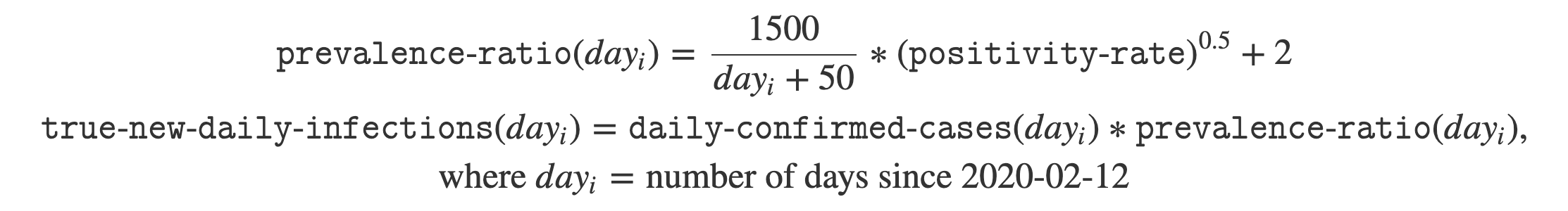
While most states report test totals by “test encounters” or “test specimens”, a few select states such as South Dakota reports tests based on “unique people”. This means that if a resident has previously received a COVID-19 test, they will only be included a single time in the “total tests”. As the writeup in the previous paragraph explain, this method of counting tests can artificially inflate the daily test positivity rate, since repeated negative tests by the same person are all discarded (unless it is the first test). So while the data would suggest that the test positivity rate in South Dakota was over 50% in November 2020, in reality, the test positivity rate is closer to 20-25% once we count test specimens rather than unique people.
While we focus only on PCR tests, some states conflate PCR and antigen tests in their reporting. This would artificially inflate the number of tests, though it’s unclear to what degree this would affect the positivity rate.
We use the data provided by The COVID Tracking Project to attempt to standardize the testing data to the same units so that the values are comparable. We assume “specimens” and “test encounters” to be equivalent units (in reality, using specimens result in a slightly lower positivity rate, but this difference is small, <5%). We just need to convert testing data with a “unique people” unit to a “specimens” unit.
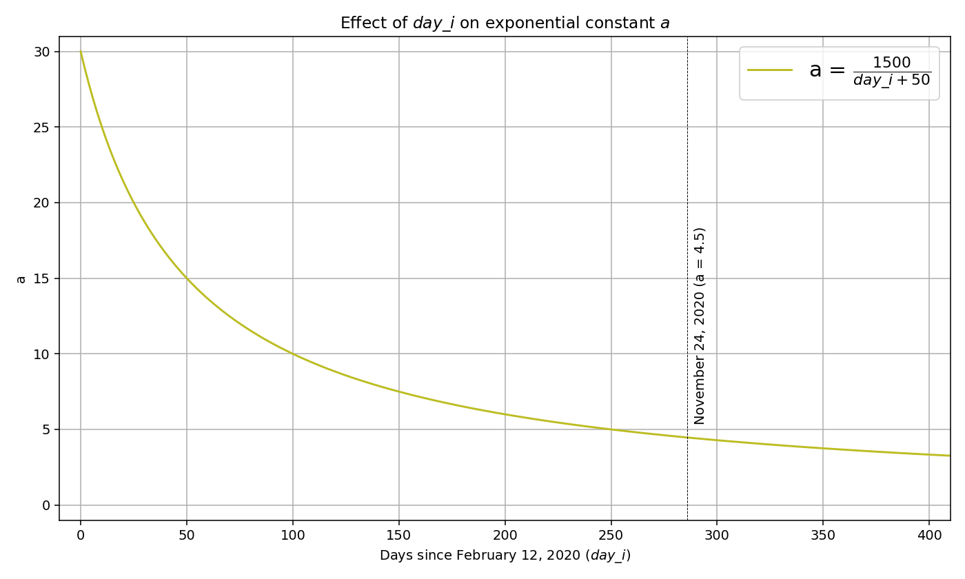
As of November 24, 2020, there are nine states where we have to do this conversion: Arizona, Iowa, Idaho, Kansas, Louisiana, Oregon, Pennsylvania, South Dakota, Wyoming. By December 8, 2020, Louisiana, Oregon, and Wyoming had begun reporting total tests using the “specimens” unit. We recommend checking The COVID Tracking Project for the latest state-by-state testing source.
This conversion is done by looking at states that provide testing data in both “unique people” and “specimens/test encounters” units. There are about 15 states that fit this criteria. We look at the ratio of the “specimens/test encounters” total tests and the “unique people” total tests over time:
ratio = total_tests_specimens_or_encounters / total_tests_unique_people
In the beginning stages of the pandemic, this ratio is very close to 1 because each person that gets tested is likely a new individual. But over time, the proportion of repeat test takers increases, and thus the ratio increases significantly above 1. We simply take the average ratio for each date and apply that ratio to states that only report the “unique people” unit. This allows us to map the unit from “unique people” to “specimens/test encounters” for every single date:
test_specimens(day_i) = test_unique_people(day_i) * avg_ratio(day_i)
We now have an adjusted test total that we can use to compute the test positivity. This adjusted test positivity shares the same units across different states, and thus can be comparable. As we mentioned in the disclaimers above, this serves as a simple estimate of the total tests rather than a rigorous calculation. In practice, we find that the approximation is fairly similar to the true values, as the ratios are fairly consistent from state to state.
Below, you can see the original and adjusted test positivity rate for South Dakota:
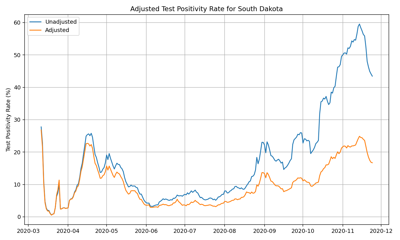
Below are the adjusted test positivity rates as of November 2020, for the nine states where the adjustments are necessary.
Prevalence Ratio
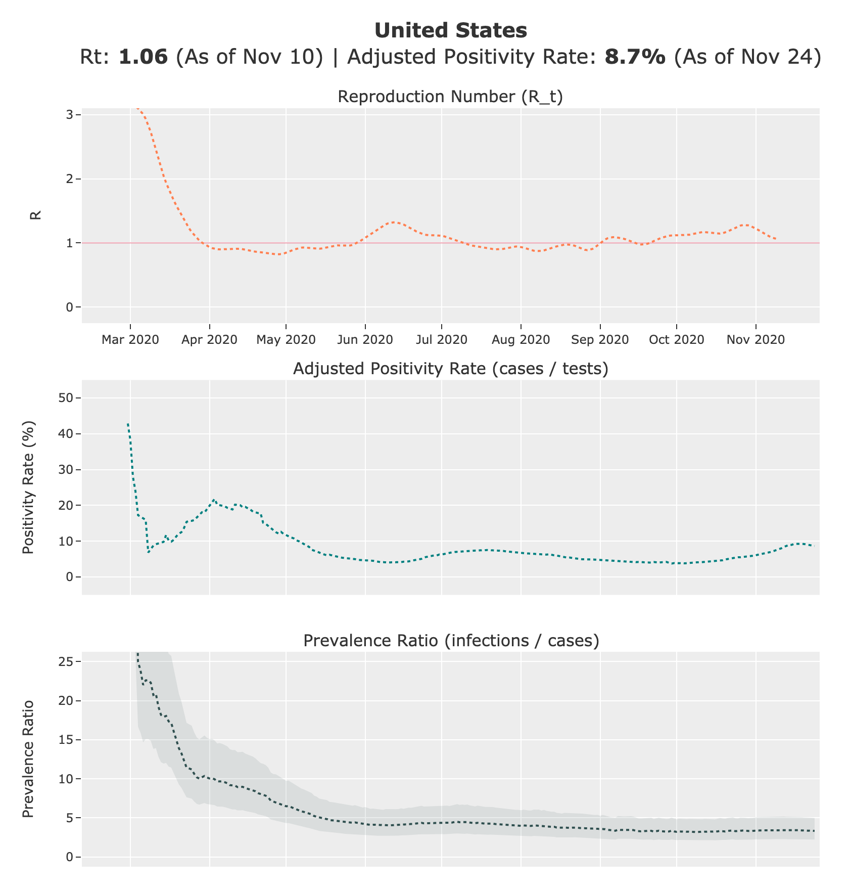
Once we have an adjusted test positivity, we can use it to compute the prevalence ratio, otherwise known as the ratio of total infections/incident cases to confirmed cases. The core idea behind this method is that we can use the positivity rate and the date to roughly determine the ratio of true infections to reported cases. The hypothesis is that as positivity rate increases, the higher the true prevalence in a region relative to the reported cases. This also makes sense intuitively: if you test everyone, then the positvity rate will be very low, and you will catch every case. But if testing is not widely available, then you will catch only the severe cases, resulting in a higher positivity rate. This phenomenon is sometimes referred to as preferential testing.
As a counter-balancing act, as the pandemic progresses over time, availability of testing increases. This not only lowers the prevalence ratio, but also lowers the impact of the the positivity rate in the determination of the true prevalence ratio. Intuitively, this makes sense as well: if everyone who wants a test can get a test, then the prevalence ratio will be constant regardless of what percentage of the tests result in a positive result. In the early stages of the pandemic, test positivity matters more as testing capacity is limited. But we believe the importance of the two variables switches over time, and hence our estimate needs to reflect this change.
For a fixed day, we believe that the relationship between test positivity rate and ratio of true prevalence is monotonically increasing (higher positivity -> higher prevalence). Of course, the exact relationship varies from state to state and across time. But if one were to take the average across all of the data, one can generate a theoretical curve. For a fixed day day_i, we believe this relationship can be approximated by a root function of the following form:
prevalence_ratio(day_i) = a * (positivity_rate)^(b) + c
where a, b, c are unknown constants.
Through curve fitting on historical test positivity and serological surveys, analysis of hospitalization and death data, simple grid search of the constants, as well as trial & error, we found that the following approximation works well:
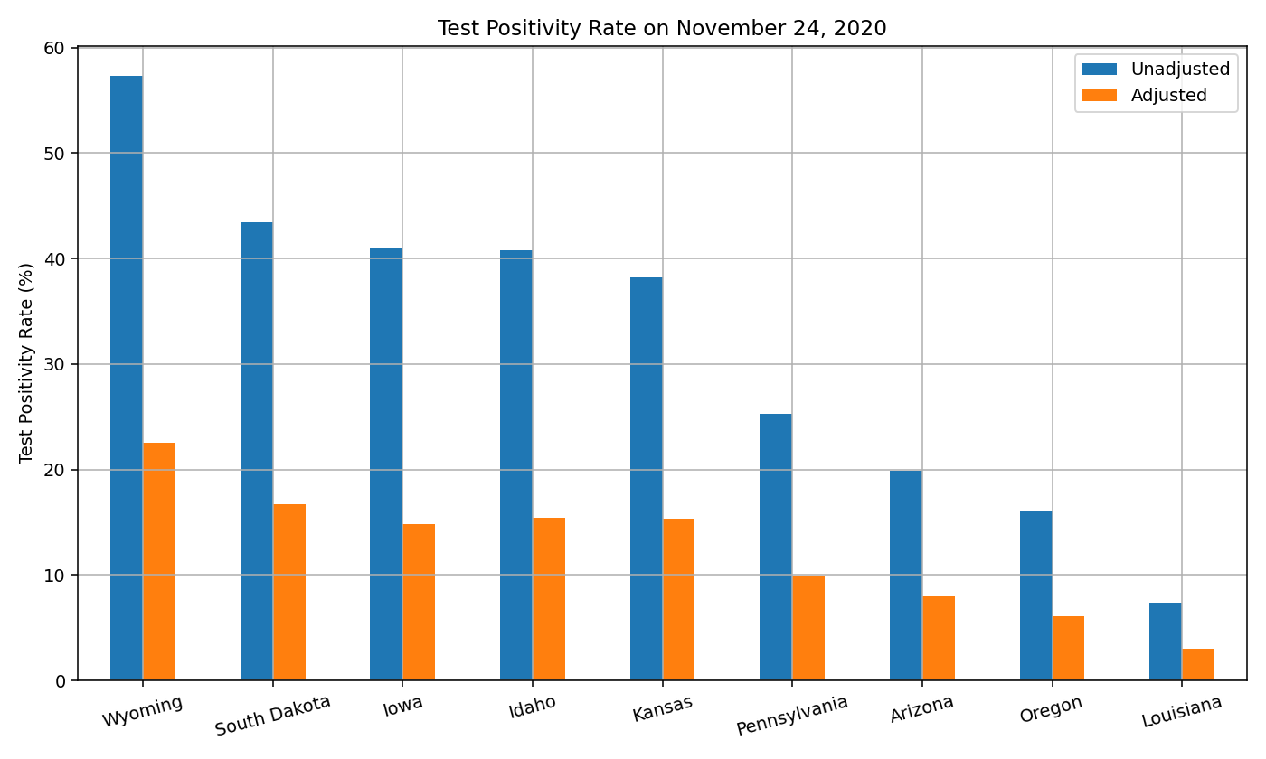
a = 1500 / (day_i + 50)
b = 0.5
c = 2
where day_i is the number of days since February 12, 2020 (14 days before the first confirmed community transmission in the US). The variable a represents the multiplier applied to the exponential function (positivity_rate)^b. This multiplier is a function of day_i because as the pandemic progresses, testing becomes more available and the test positivity plays a smaller role on determining the prevalence ratio. Below you can see the plot for a = (1500 / (day_i + 50):
After substituting the variables, we get:

Note that since b=0.5, the exponential function is equivalent to the square root function. The above equation means that our prevalence ratio estimate on any given day is based on only two variables: the positivity rate and the number of days that have passed since February 12, 2020. As positivity rate increases, the prevalence ratio will also increase. As the pandemic progresses and we move further away from February 2020, testing becomes more accessible and hence the prevalence ratio will decrease.
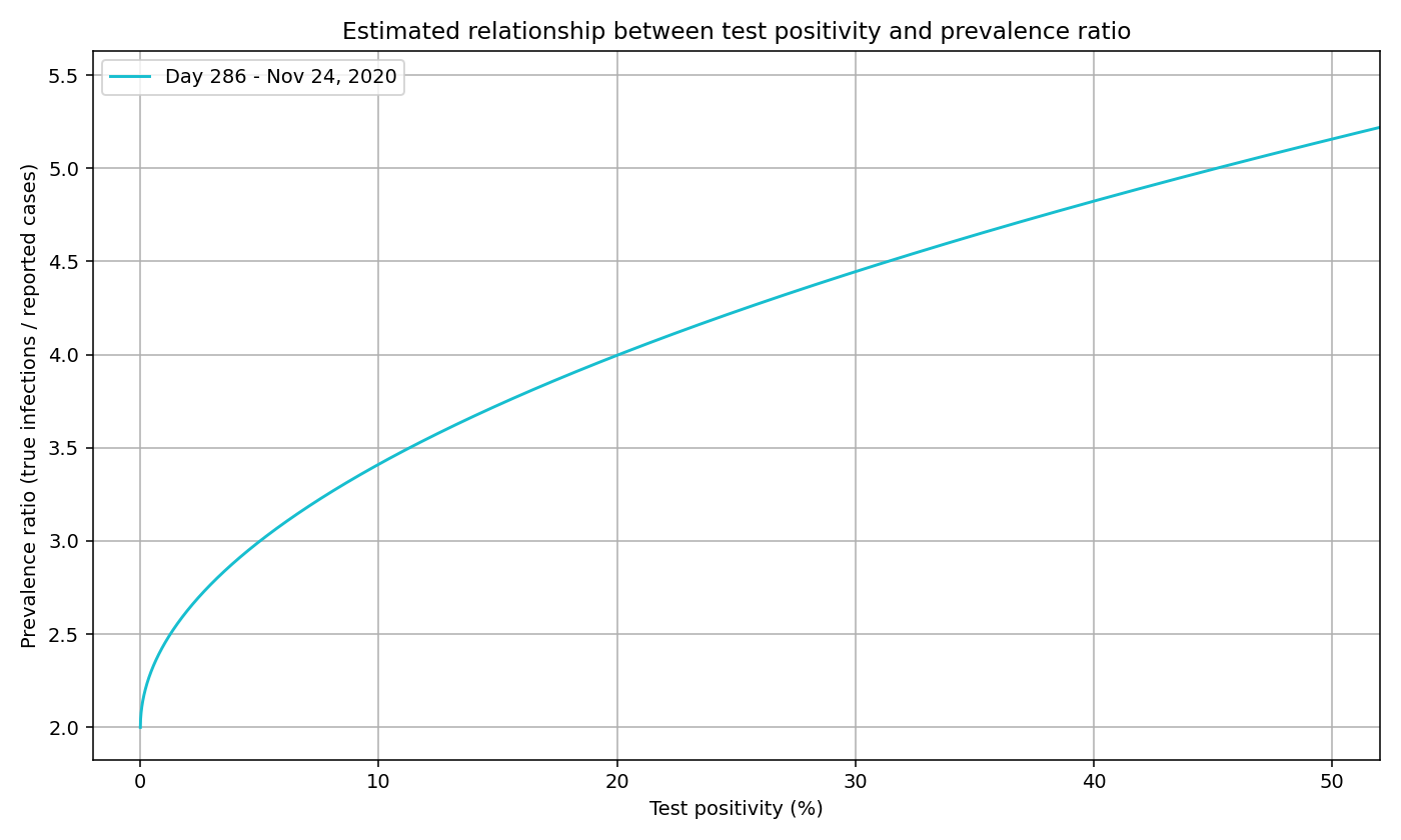
To calculate the prevalence ratio for November 24, 2020 (day 286), we first use the formula above to find the value of a (4.5). We can then substitute the values of a, b, c to get the below formula and plot:
prevalence_ratio(day_i) = 4.5 * (positivity_rate(day_i))^(0.5) + 2
We can generate a curve for each day, not just November 24. We plot a sample of days below. Note that the curve lowers and flattens as the pandemic progresses, signaling 1) a lower prevalence ratio as testing expands and 2) the decreasing effects of test positivity.
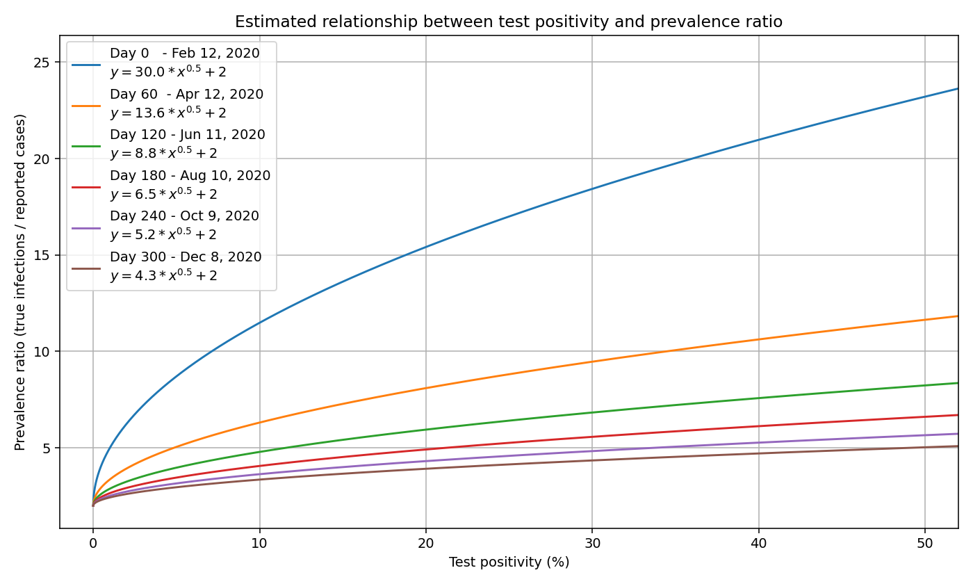
Note that the prevalence ratio is only applicable for a given day, and changes from day to day. One cannot apply the same prevalence ratio to the total number of cases, because the prevalence ratio is different on each day.
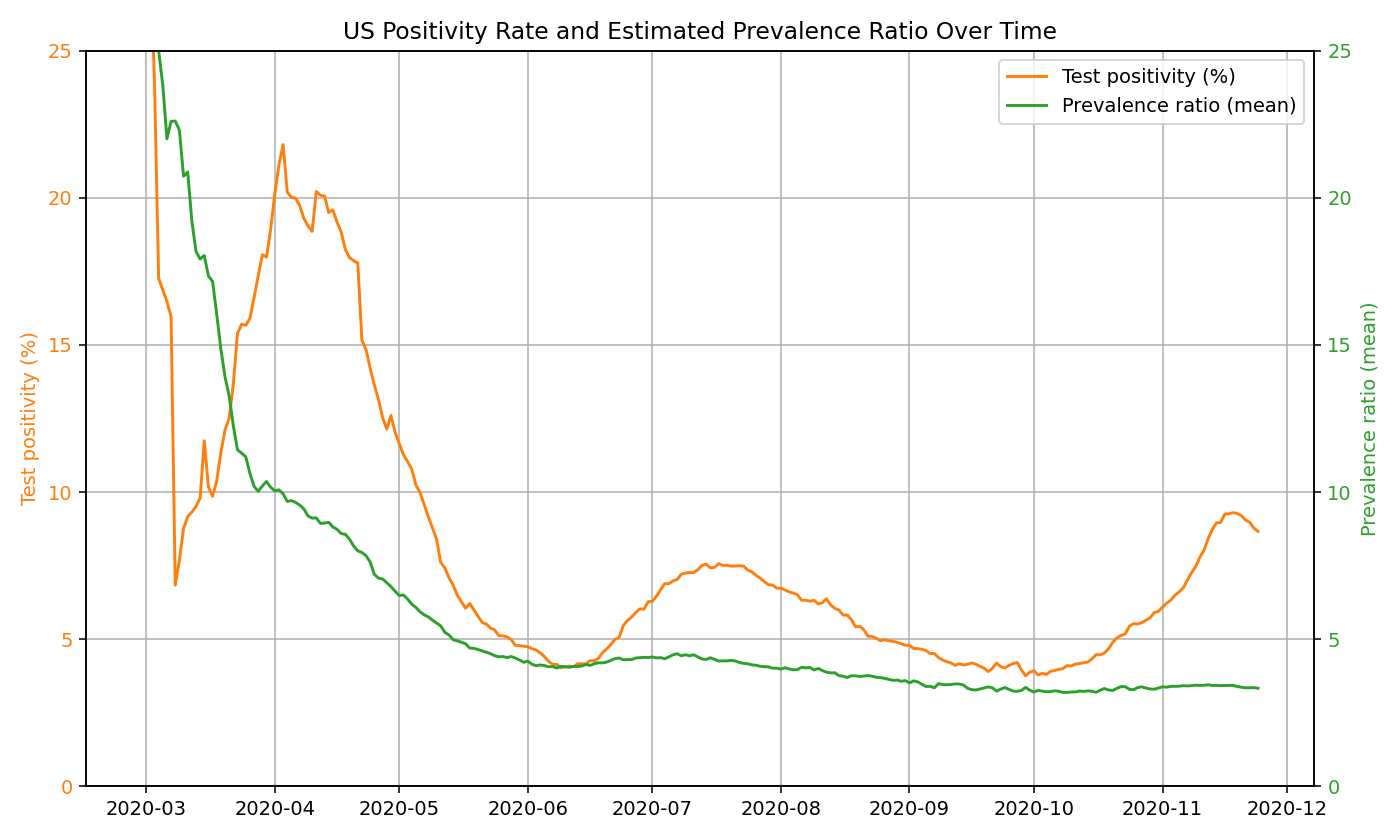
To see if this relationship passes the “common sense test”, we can take a look at the US positivity rate over time (see graph below). In March/April, the US positivity is around 20%, which corresponds to a prevalence ratio of roughly 10x the number of reported cases when using the function above. This seems to be a reasonable estimate, and matches estimates provided by the CDC. In New York and New Jersey during this period, test positivity was around 40-50%, which corresponds to a roughly 12-15x prevalence (later substantiated by serology surveys). In June, when test is more widely available and the US positivity rate is ~5%, the function estimates a prevalence of roughly 4x the number of reported cases. We use a y-intercept of 2 to indicate minimum prevalence ratio of 2x (50% detection rate) to account for the high proportion of asymptomatic individuals (~40% according to the CDC).
In our calculations, we compute the prevalence ratio on each day for each state based on the positivity rate. In the below graph, we show how test positivity rates and our mean prevalence ratio estimates change over time in the US:
Estimating True Infections
Once we have the prevalence ratios, the next step is to map all reported cases to true new infections by multiplying the daily confirmed cases with the prevalence ratio:
For all computation purposes, we use the 7-day moving average of confirmed cases and positivity rates. Combining the two functions from above, we get:

As an example, let’s say that the US reported 67,000 new cases with a 8.5% positivity rate on July 22 (day 160). This would result in a true prevalence ratio of (1500 / (160 + 50) * sqrt(0.085) + 2 = 4.1. We can then multiply this ratio by the confirmed cases to get the true new infections. In this example, we estimate there to be 4.1 * 67,000 = ~275,000 true new infections.
Because reported cases lag infections by roughly two weeks, we must shift the result back to more realistically pinpoint when a new infection occurred. So the 275,000 true infections from the example above actually took place approximately 14 days before July 22, on July 8. Prior to March 2, 2021, we used a constant lag of 14 days in our estimates for simplicity. Starting from our March 2, 2021 estimates, we used a variable lag that starts at 21 days in February 2020 and goes to 14 days in June 2020 (and remains constant since). This is because we believe there is a longer delay from infection to case report during the early days of the pandemic when testing was more restricted. This is implemented as a one-dimensional linear interpolation.
To further smooth the data, we take the 7-day moving average of the true new daily infections. Starting on January 21, 2021, we apply an additional smoothing step around holidays to minimize reporting dips.
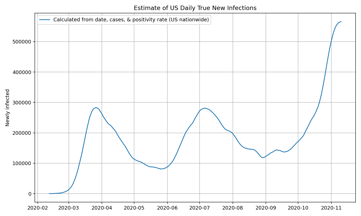
US estimates using nationwide data
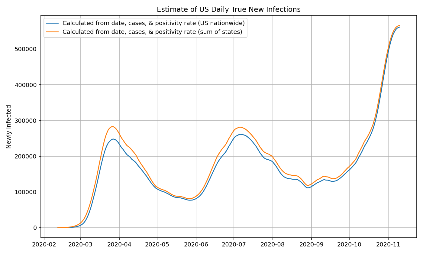
For estimate true infections in the US as a whole, we can compute the true prevalence ratio by passing in the daily country-wide positivity rate and date to our approximation function above. We then multiply the true prevalence ratio by the number of confirmed cases each day to get the number of true new infections. Following the steps explained in the previous section. We can now plot the results:
US estimates using state-by-state data
Rather than using the US nationwide cases and positivity rates, we can also use the state-by-state cases and positivity rates to compute the true new infections for each state using the same method described above.
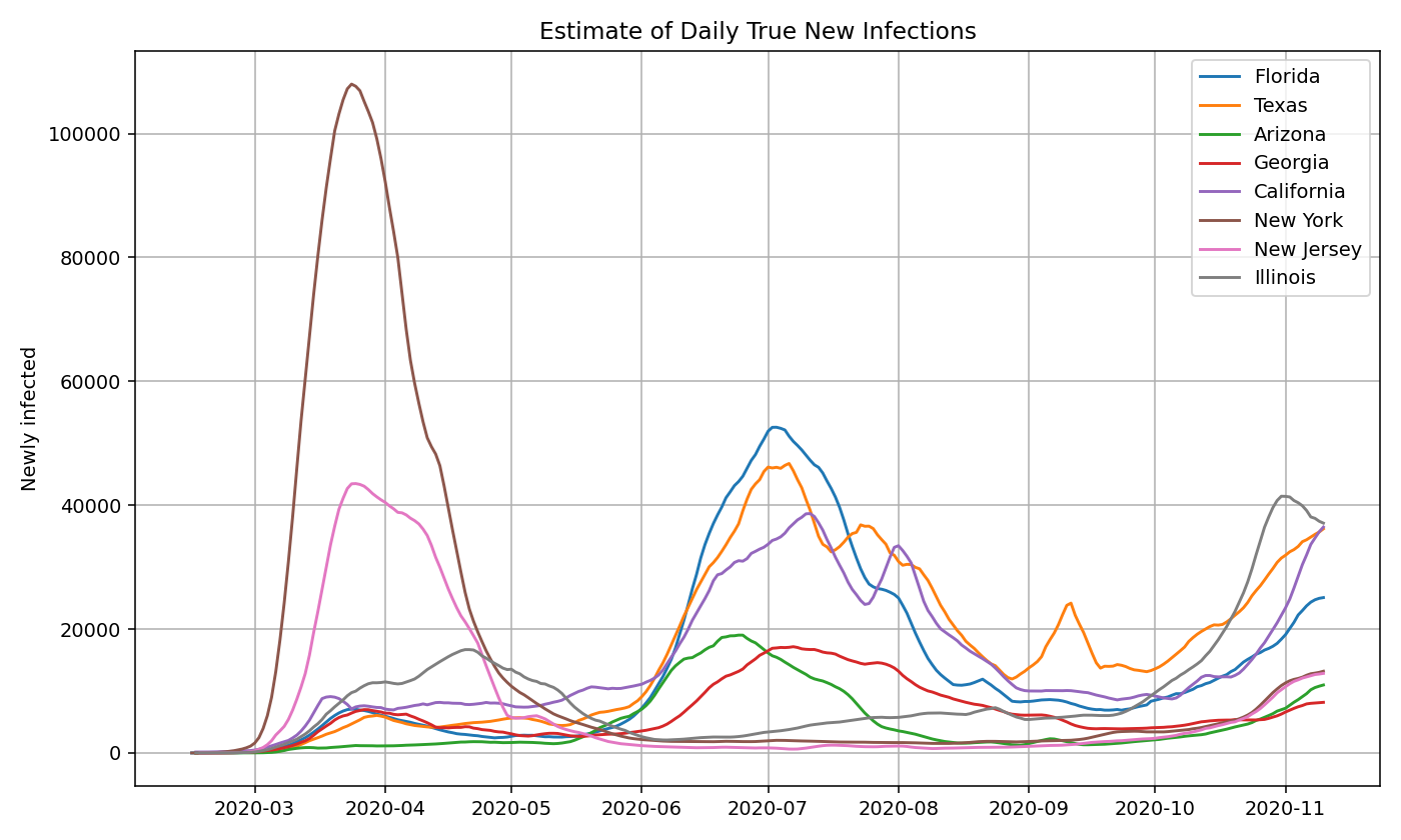
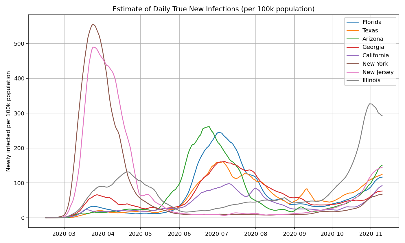
We plot the true infection estimates for a few select states based on both an absolute and per capita basis:
Then, we take the sum of the infections estimates for all 50 states and territories to get the nationwide daily new infections. Note that it closely aligns with the graph generated using the US nationwide data.
Using nationwide estimates of positivity rates and cases (rather than state-by-state estimates) may lead to a slight under-estimate in the number of true infections. We suspect this is partly because a sizable number of states with low prevalence still do a large amount of testing, which artificially deflates the positivity rate and thereby decreases the prevalence ratio. This difference is reduced as time goes on and test positivity become less of a factor.
True Infections for US Counties
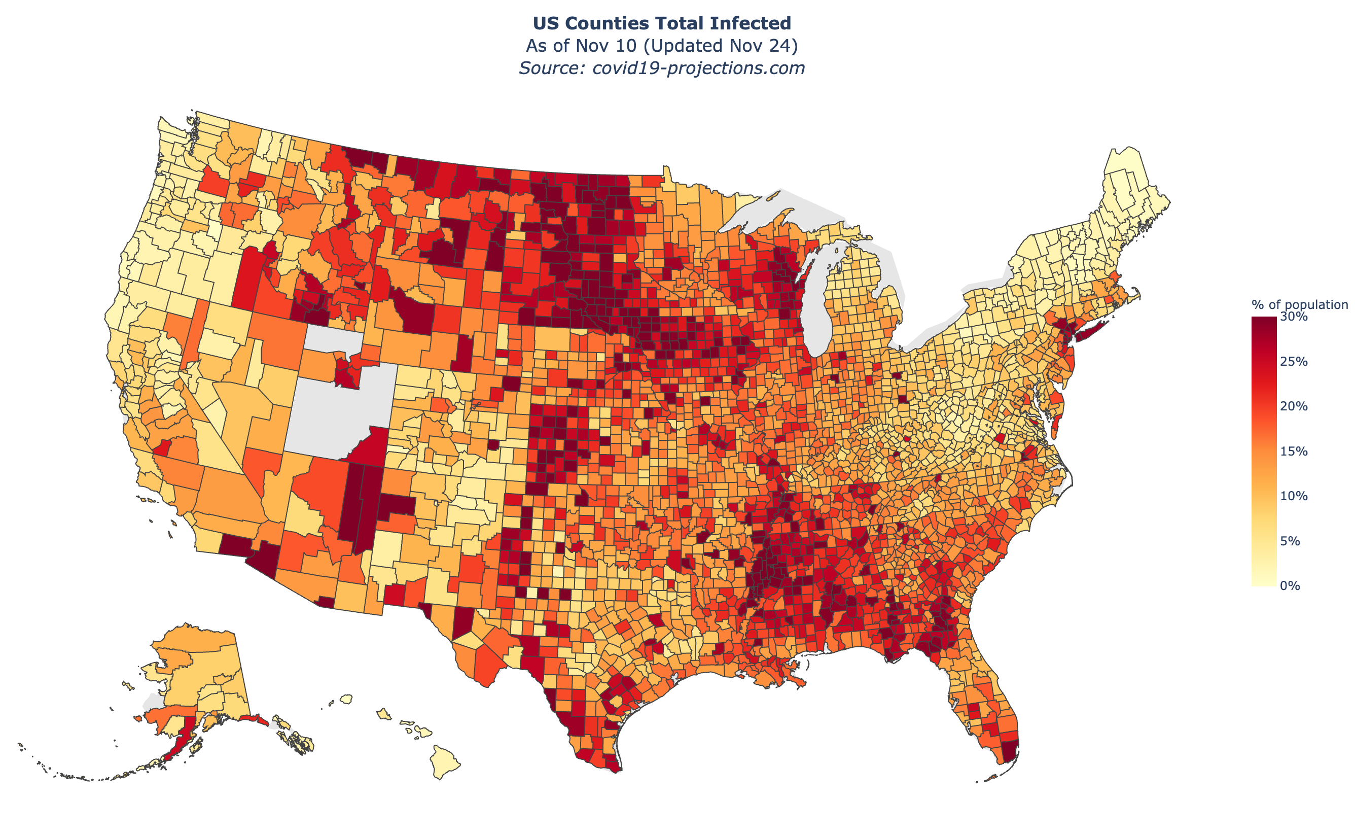
To compute the true infections for a US county, we use the calculated prevalence ratio for the state in which the county is located in and multiply it by the confirmed cases in that county. This is done in the same manner as the state-level estimates. While the state’s prevalence ratio is not necessarily a perfect indicator of the prevalence in the county, we believe it is a reasonable approximation.
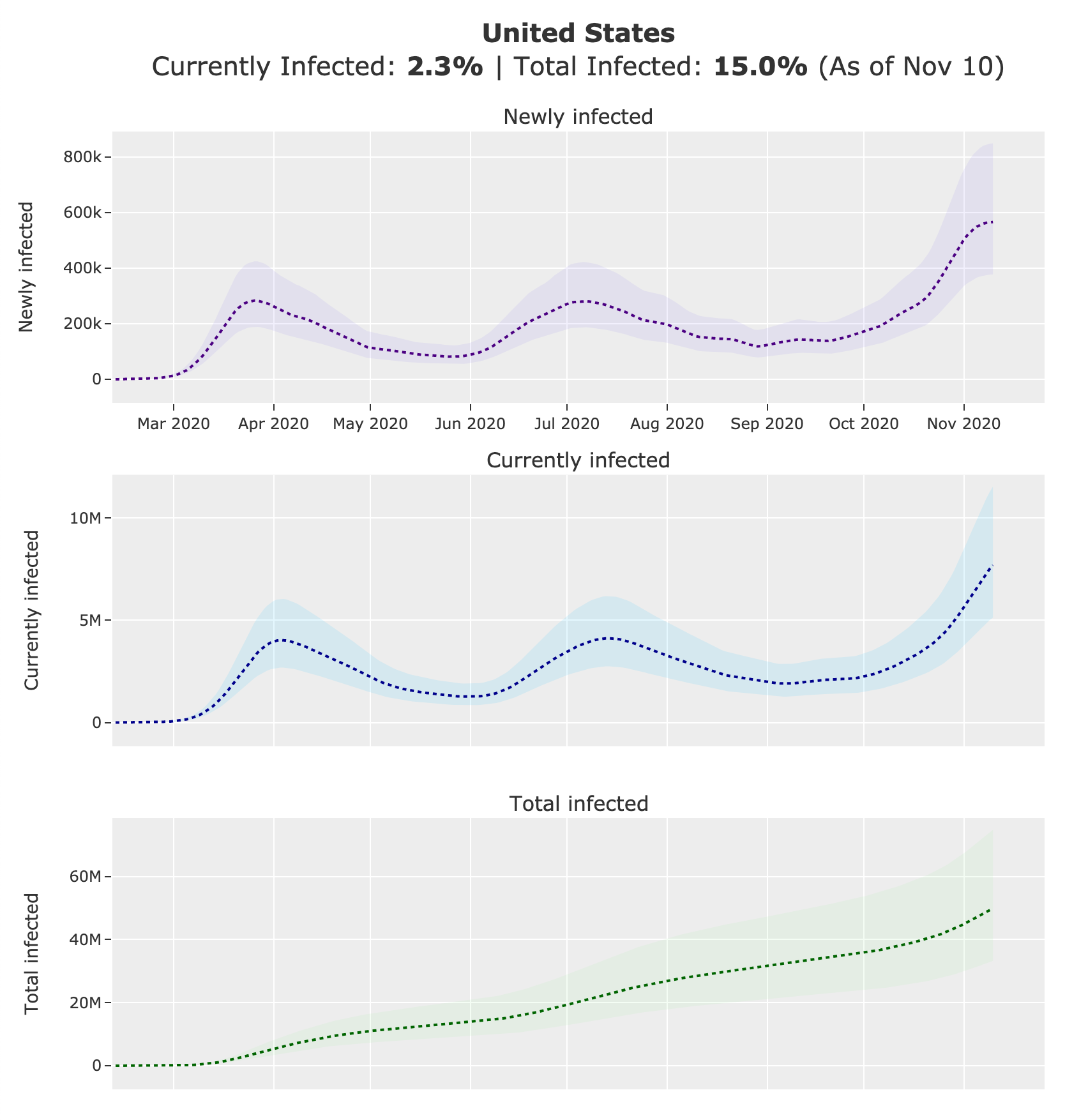
Below is a map of our US county-level estimates for “percent total infected” as of November 10, 2020. You can view an interactive version on the Maps page.
Currently Infected and Total Infected
To compute the number of “currently infected” individuals in a region, we take the 15-day rolling sum of the “newly infected” individuals. To compute the number of “total infected” individuals in a region, we take the cumulative sum of the “newly infected” individuals. We divide the currently infected and total infected values by the population of the region to determine the “percent currently infected” and “percent total infected”. We assume that reinfection is negligible.
Confidence Intervals
To compute the lower and upper bounds of the prevalence ratios, we simply take 50% and 150% of the calculated mean prevalence ratio. We then use the lower and upper bounds to compute the lower and upper bounds of the “newly infected” estimates. Finally, we use the lower and upper bounds of the “newly infected” estimates to compute the lower and upper bounds of the “currently infected” and “total infected” estimates. We will leave it as an extension to develop a more sophisticated confidence interval.
Additional Modifications
Because data can be noisy, we made some additional minor adjustments to the data to make the outputs cleaner and more reasonable. Here is a short list of these modifications:
- Removing outliers (e.g. North Carolina removed 194,215 tests on August 12)
- Limiting the positivity rate to be between 0-1%
- Applying a floor to the prevalence ratio:
max(1, 30 - day_i * 0.5) - Reducing the prevalence ratio for states with
daily_tests_per_100k > 500(multiplier:np.log(500) / np.log(daily_tests_per_100k)) - If total cases goes above 0 and then later goes back to 0, we set the total cases of the entire time period to 0
covid19-projections.com
We present all of the estimates described above on our website, covid19-projections.com. Below are screenshots of the US nationwide page as of November 24, 2020.
Distribution of Infections by Age
Using CDC’s COVIDView Data that breaks down tests and confirmed cases by age, we can see that the median age of confirmed cases has significantly decreased over the first few months of the pandemic:
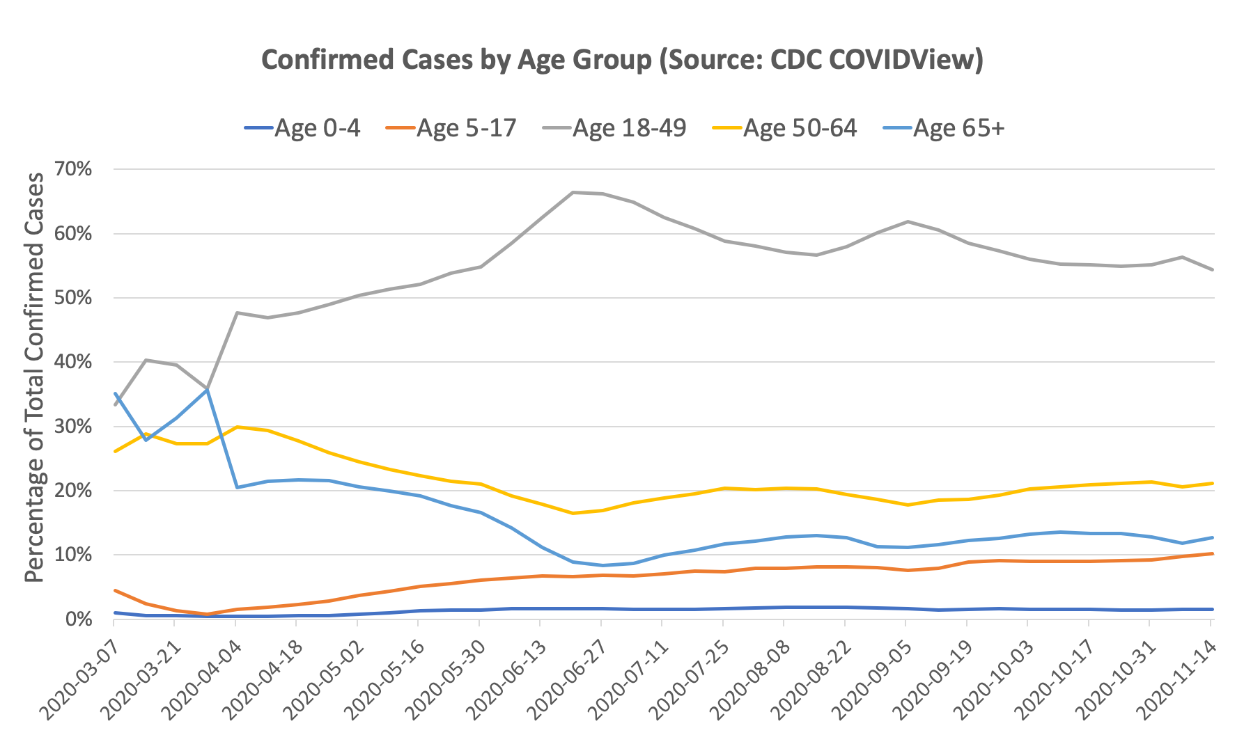
Of course, there can be selection bias on how different age groups are getting tested. One can argue that the reason there is a higher proportion of older people in March/April relative to June/July is because testing was limited, and hence older individuals were prioritized for testing. If that were the case, one would expect that older age groups have a lower positivity rate than the younger age groups (since we are catching more cases). But if looking at the data, the opposite is true: in March/April, the older age groups actually had a higher positivity rate than the younger age groups. By our prevalence ratio calculation above, this indicates that the prevalence is actually even higher in the older age groups than the younger age groups. Intuitively, this may be explained by susceptibility: older individuals are more susceptible and hence more likely to catch the virus early on, especially when prevalence was low. This trend was reversed starting in May, and now younger age groups have a higher positivity rate than older age groups.
We can use our prevalence ratio formula from above to estimate the proportion of true infections by age group given the number of confirmed cases and test positivity rates on each date:
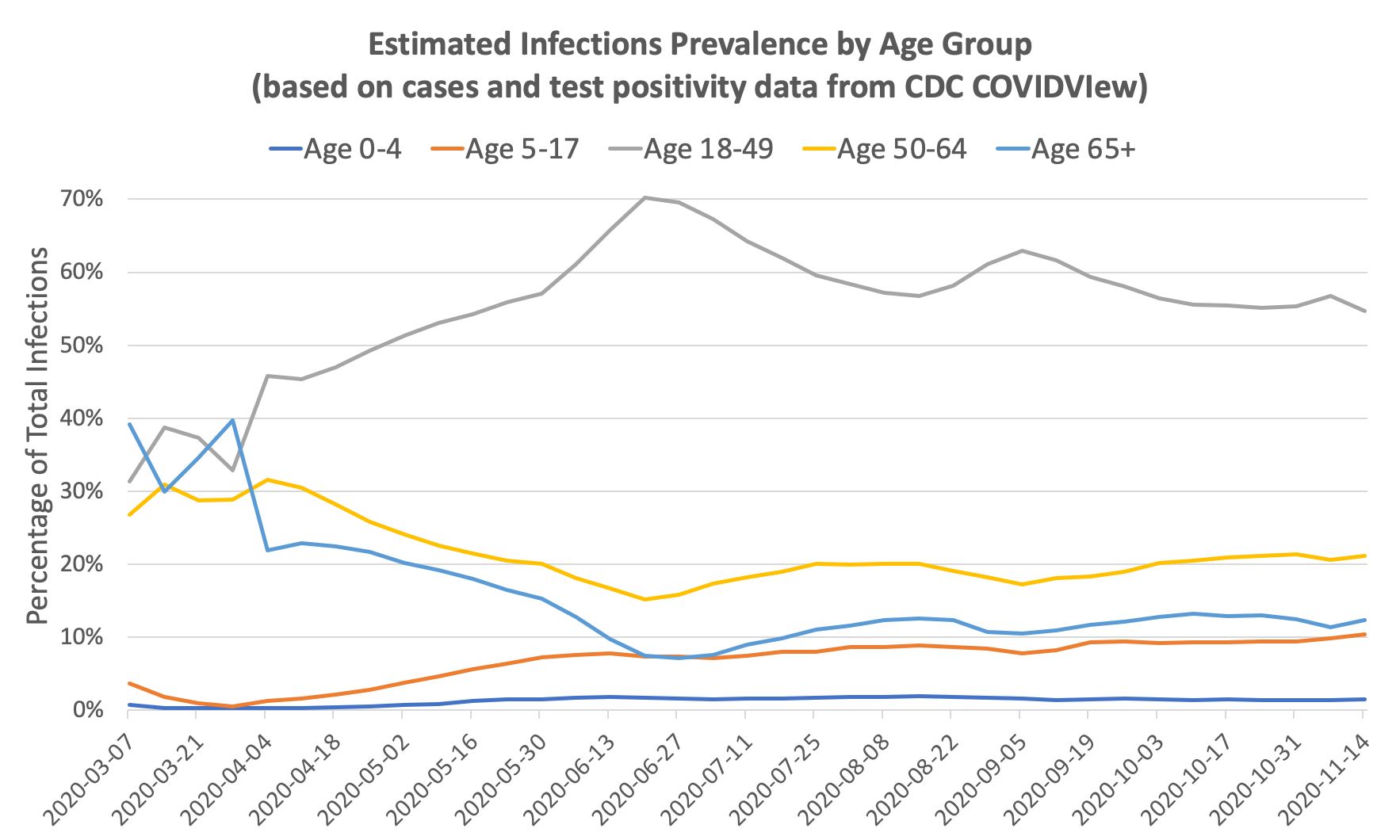
You can see that the change in distribution from old to young is even more pronounced after accounting for test positivity. The ratio of prevalence in individuals ages 18-49 to prevalence in individuals ages 65+ went from roughly 1x in March to 10x in June. Since the infection fatality rate in those age 65+ is roughly 10-50x that of those ages 18-49, it’s no surprise that the overall infection fatality rate in the US dropped significantly between March and July. The IFR is further lowered by improving treatments and earlier detection.
As an addendum, the above chart can also explain why reported deaths in the US continued to fall through June despite an increase in cases: the increase in cases is largely driven by younger people with a low infection fatality rate. Unfortunately, the pattern in July suggests that the age distribution of infections reverted back towards a higher median age of infection, resulting in a sharp spike in deaths towards the end of July.
Implied Infection Fatality Rate (IIFR)
We can use these estimates of true infections to compute the implied infection fatality rate (IIFR) for the US by taking the reported deaths from 28 days into the future (7-day moving average) and dividing it by the true infections (7-day moving average). The IIFR in our calculation only looks at official, reported COVID-19 deaths. If there are significant amounts of excess/unreported COVID-19 deaths, then our IIFR estimate will be an underestimate of the true IFR. See work from the Weinberger Lab for their analysis of excess deaths.
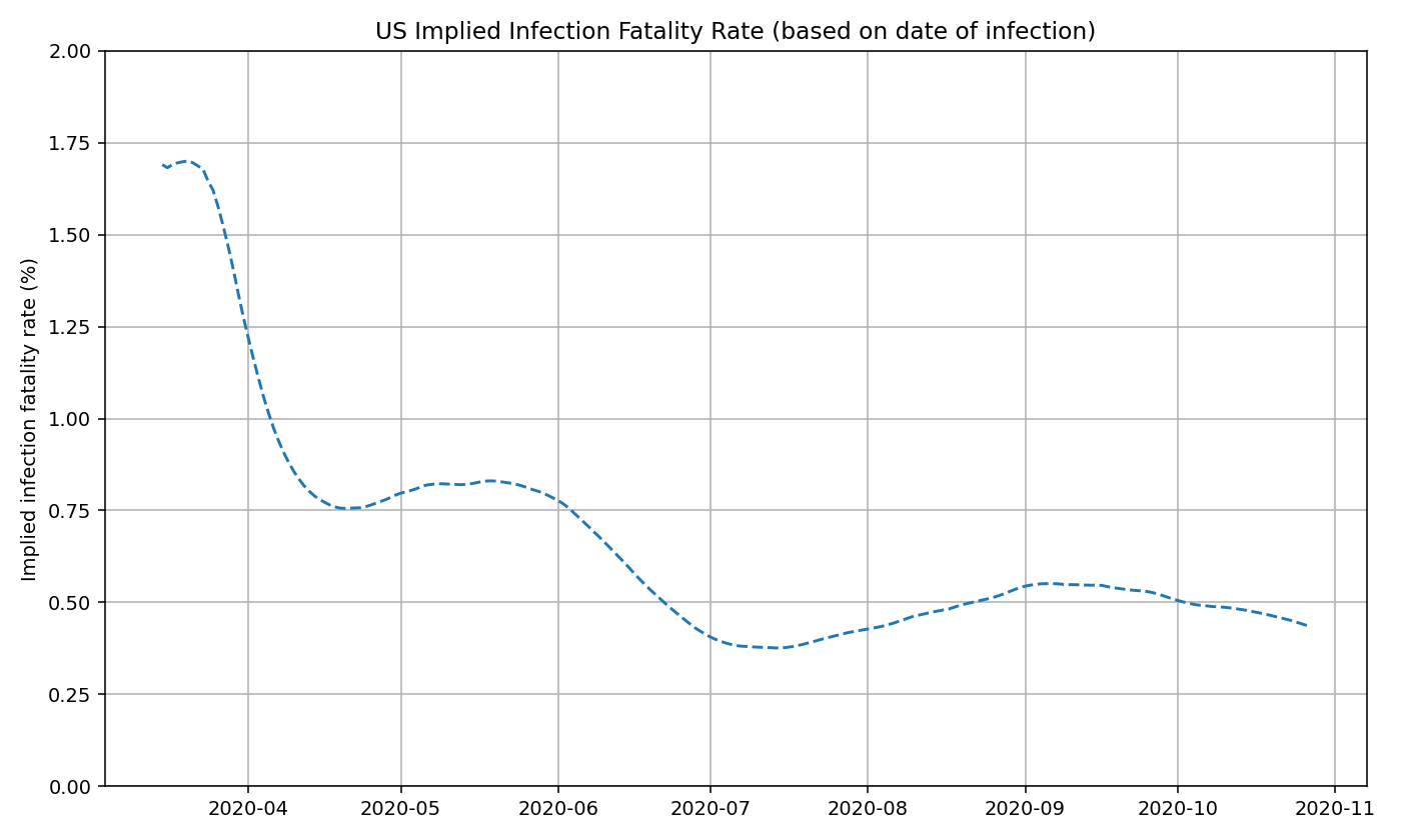
We believe that the IIFR is mostly stable at around 0.5% since June. The minor fluctuations are most likely a product of the reporting delay for deaths rather than a true change in the IIFR (i.e. deaths are backlogged during the initial stages of a new wave, and are “caught up” on later).
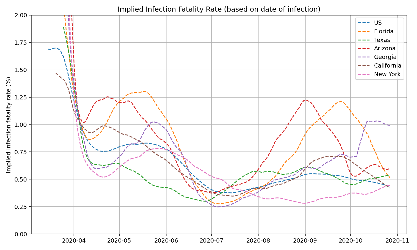
We can also do this analysis on a state-by-state basis. See below for IIFR plots for select states.
As a rough estimate, we believe that COVID-19 deaths in the US are undercounted by roughly 30-40%. So an IIFR of 0.5% would imply a true, age-adjusted IFR of around 0.6-0.8%. This is consistent with published reports and CDC estimates.
Discussion
Relationship between Positivity Rate and Prevalence Ratio
We developed the constants for the prevalence function (prevalence_ratio = a * (positivity_rate)^(b) + c) through a combination of trial & error and curve fitting. We don’t believe this function is perfect. There can be other values for a, b, and c that may be a closer approximation of the true relationship. Because there is no “truth” value to fit the function against, we decided there is limited value in trying to rigorously fit this function.
The exact relationship between positivity rate and prevalence ratio may be different from state to state and across time. Here is a partial list of possible factors that can cause these differences:
- Availability of testing - the greater the number of tests performed (as a percentage of the population), the less the undetected prevalence ratio becomes, and the less the role of positivity rate becomes. See paper by Burger & McLaren for a more in-depth view.
- Differences and changes in reporting guidelines (also explained above)
- Counting repeated positive tests (skews positivity up)
- Counting repeated negative tests (skews positivity down)
- Not reporting all positive tests (skews positivity down)
- Not reporting all negative tests (skews positivity up)
- Only reporting Electronic Laboratory Reporting (ELR) tests (skews positivity up)
- Mixing serology tests with PCR (skews positivity up)
- Backlog, delay, or lag in test results - if tests take more than a few days to be reported, then it may no longer be an accurate representation of how new infections are changing. Furthermore, positive tests often receive priority for processing, which may temporarily skew the positivity rate upwards
- Shifting age demographics - As we explained above, test positivity rates are higher in younger age groups. So a lower median age of infection may also result in a higher positivity rate, causing a possible confounding factor.
Lower IIFR Over Time
We’ve shown that the implied infection fatality rate (IIFR) in the US have decreased from over 1% in March to around 0.5% from July onward. Below, we present a few possible explanations to why the IIFR in the US has decreased significantly since March/April.
- Lower median age of infection (see previous section)
- Improved treatment (new drugs, better allocation of resources, more experience among staff, etc)
- Better protection of vulnerable populations (nearly half of COVID-19 deaths in March/April were in care homes)
- Earlier detection
- Seasonality
- Selection bias (Higher susceptibility in individuals who contracted the virus earlier on)
The above explanations would explain a true decrease in IFR. Below are some reasons that could skew the IIFR lower, but not change the true infection fatality rate:
- More comprehensive reporting of confirmed cases
- Changes in the distribution of age groups tested (e.g. more young people getting tested would skew IIFR down)
- Inflation of the test positivity rate (e.g. double-counting positives, not reporting negatives, etc)
- Longer lag in death reporting
- Underreporting of deaths
Conclusion
To conclude, we presented a simple nowcasting model that standardizes the test positivity rates of every US state and estimates the true prevalence of COVID-19 infections in the United States.
Using this methodology, we found that the peak prevalence is roughly equal in the US during June/July and during in March/April (peak of ~300,000 new infections per day), but significantly higher in October-December (over 500,000 new infections per day). However, the implied fatality rate is lower from June onward (~0.5% IIFR) compared to March-April (~1% IIFR).
While this is by no means a comprehensive study, we hope this work can help other scientists and researchers better understand the changing dynamics of this disease over time.
The data and results used on this page can be found on GitHub.